(This page includes affiliate links. If you click and purchase, I receive a small commission at no extra cost from you and that way you can support me. I only recommend tools that I have personally used and loved.)
Tutorial Video:
Introduction – Interactive Cursor with easy customization
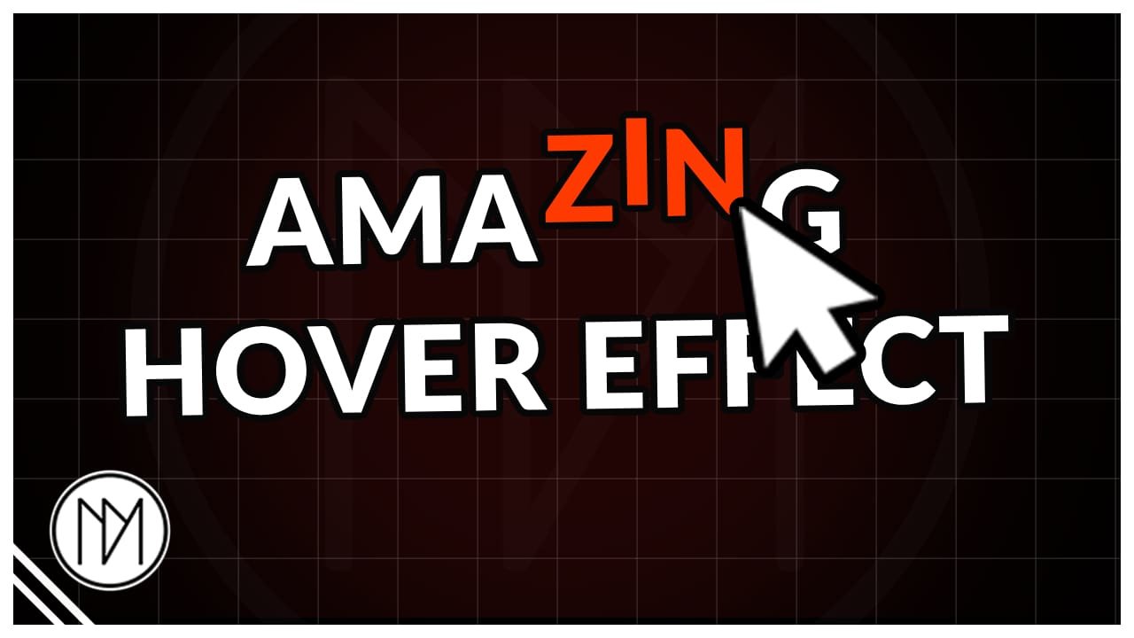
In this tutorial, we will replace our standard cursor with a dot and ring. You can remove the ring if you want. Both dot and rings are highly customizable and we can also make it expand on hover.
Hover Over Me To See The Effect In Action
Interactive Fancy Cursor Code
- This works with Elementor Heading (v3) widget. If you wish to use v4 or if you’re not using Elementor at all. Then simply change the line 31 and remove .elementor-heading-title.
- dm-char-hover-effect is the CSS class given to our text.
- Initial text color is added in line 6.
- At line 59, we add the effects we want when we hover. Right now, it moves -10px above and changes color to red. But you can add even more effects that you like.
- From line 74 and line 98, we add the effects we want to happen when animation finishes or hover ends.
					<style>

    /*Initial state*/
    .dm-char-hover-effect .char-wrap .char{

        color:black;
        transition:none !important;

    }

    .char-wrap {

    display:inline-flex;
    width:fit-content;

    }


</style>

<script src="https://cdnjs.cloudflare.com/ajax/libs/gsap/3.15.0/gsap.min.js" integrity="sha512-oJ8QbaQThQoJZ7oEv+29jfPM6CcP+zUxh3PKJs1vyOhx0UraUrE7PQgeItu3dOuCJyrzWpoYMsVjkkPEBzbUqw==" crossorigin="anonymous" referrerpolicy="no-referrer"></script>
<script src="https://cdnjs.cloudflare.com/ajax/libs/gsap/3.15.0/SplitText.min.js" integrity="sha512-LFdAHEel9Gwq2HmgZUgnl3mLwXjC6nrfMU6IRLA2AOaKQaWgdrT8ZlmI2ZjVkgB32TeYyi7KdD80ihb9W6uH8Q==" crossorigin="anonymous" referrerpolicy="no-referrer"></script>

<script>
gsap.registerPlugin(SplitText);

document.addEventListener("DOMContentLoaded", () => {

    const split = new SplitText(
        ".dm-char-hover-effect .elementor-heading-title",
        {
            type: "words,chars",
            charsClass: "char"
        }
    );

    split.chars.forEach(char => {

        const wrapper = document.createElement("div");
        wrapper.className = "char-wrap";

        char.parentNode.insertBefore(wrapper, char);
        wrapper.appendChild(char);

        let leaveRequested = false;
        let isAnimatingUp = false;

        wrapper.addEventListener("mouseenter", () => {

            leaveRequested = false;

            if (isAnimatingUp) return;

            isAnimatingUp = true;

            gsap.to(char,{

                //Hover Effects
                y:-10,
                color:"red",

                duration:0.25,
                ease:"power2.out",

                overwrite:true,

                onComplete(){

                    isAnimatingUp = false;

                    if(leaveRequested){

                        gsap.to(char,{
                            y:0,
                            color:"",
                            duration:0.8,
                            ease:"elastic.out(1,0.35)"
                        });

                    }

                }

            });

        });

        wrapper.addEventListener("mouseleave", () => {

            if(isAnimatingUp){

                // Wait until the upward animation finishes
                leaveRequested = true;

            }else{

                gsap.to(char,{
                    y:0,
                    color:"",
                    duration:0.8,
                    ease:"elastic.out(1,0.35)",
                    overwrite:true
                });

            }

        });

    });

});
</script>