(This page includes affiliate links. If you click and purchase, I receive a small commission at no extra cost from you and that way you can support me. I only recommend tools that I have personally used and loved.)
Required for Custom CSS.
1 – Elementor Pro

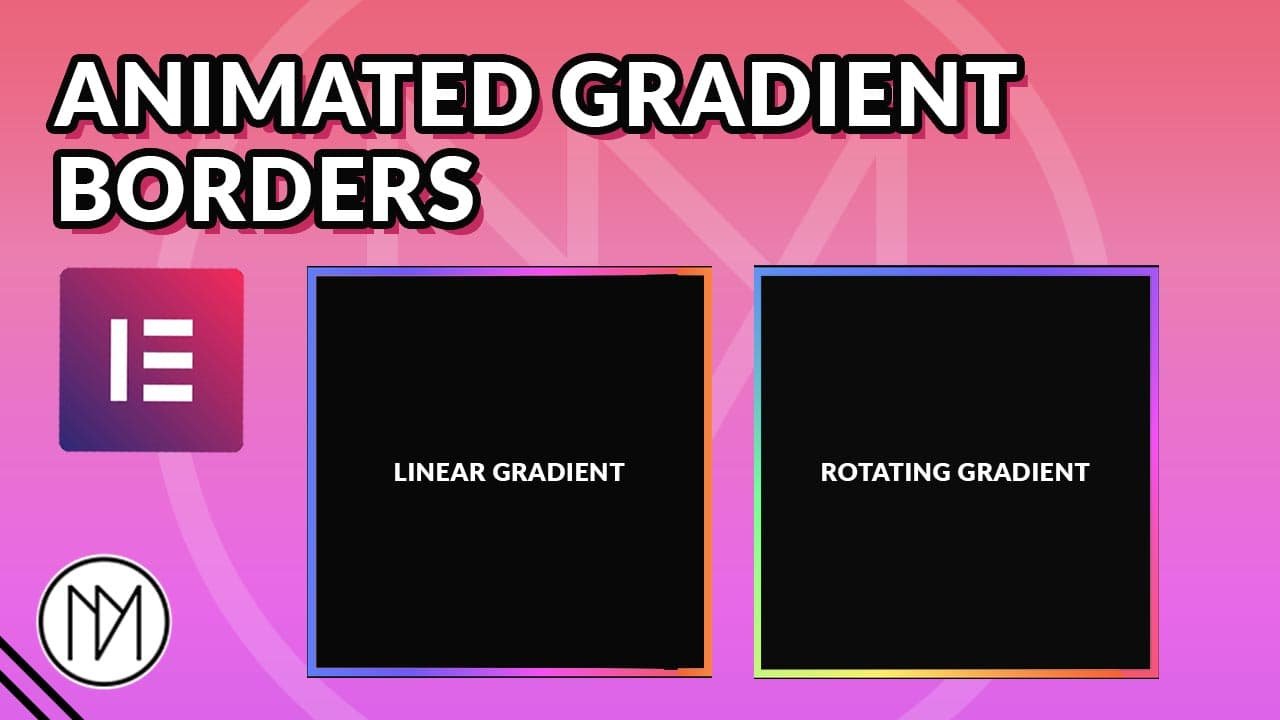
Animated Linear Gradient Border for Elementor Containers CSS code
.dm-linear-gradient-border : Add this CSS class to your container
–gradientHeight and –gradientWidth : Change 20px to your desired border size
Change 2s to your desired time for the animation.
background:linear-gradient(90deg, #FF6D1B, #FFEE55, #5BFF89, #4D8AFF, #6B5FFF, #FF64F9, #FF6565); Change the hex codes to your desired color gradient
Following steps are necessary to make it work:
1 – In the Parent Container (In below example, it is the black container), add the code selector { z-index: 1 }; , here you can add any z-index as the gradient is given z-index: -1.
					.dm-linear-gradient-border:after {


    --gradientHeight:calc(100% + 20px);
    --gradientWidth:calc(100% + 20px);

    content:'';
    position: absolute;
    height: var(--gradientHeight);
    width: var(--gradientWidth);
    top: calc((100% - var(--gradientHeight)) / 2);
    left:calc((100% - var(--gradientWidth)) / 2);;
    background:
    linear-gradient(90deg, #FF6D1B, #FFEE55, #5BFF89, #4D8AFF, #6B5FFF, #FF64F9, #FF6565);
    background-size: 200%;
    animation: animateBorder 2s infinite linear;
    z-index: -1;

}

@keyframes animateBorder {
  0% {background-position: 0}
  100% {background-position: 200%}
}
Animated Rotating Gradient Border for Elementor Containers CSS code
.dm-rotating-gradient-border : Add this CSS class to your container
Change 2s to your desired time for the animation.
background:linear-gradient(90deg, #FF6D1B, #FFEE55, #5BFF89, #4D8AFF, #6B5FFF, #FF64F9, #FF6565); Change the hex codes to your desired color gradient
Following steps are necessary to make it work:
1 – In the Parent Container (In below example, it is the black container), add the code selector { z-index: 1 }; , here you can add any z-index as the gradient is given z-index: -1.
2 – The container that contains the below CSS code, should be set to overflow:hidden. Else the gradient would overflow outside the container and whole page.
This one works different from the above. The below code adds rotating gradient to the container, once you add it to your desired container, you need to add another container inside in it for the contents and give a solid color. Make the container that has rotating gradient effect have some padding, example : 20px. This would make the gradient container look like a border.
					.dm-rotating-gradient-border:after {

    --gradientHeight2:10000px;
    --gradientWidth2:10000px;


    content:'';
    position: absolute;
    height: var(--gradientHeight2);
    width: var(--gradientWidth2);
    top: calc((100% - var(--gradientHeight2)) / 2) ;
    left:calc((100% - var(--gradientWidth2)) / 2);;
    background:
    conic-gradient(#FF6D1B, #FFEE55, #5BFF89, #4D8AFF, #6B5FFF, #FF64F9, #FF6565);
    background-size: cover;
    background-position: center center;
    background-clip:border-box;
    animation: animateBorder2 2s infinite linear;
    z-index: -1;

}


  @keyframes animateBorder2 {
  0% {
    transform: rotate(0deg);
  }
  100% {

    transform: rotate(360deg);
  }
}