(This page includes affiliate links. If you click and purchase, I receive a small commission at no extra cost from you and that way you can support me. I only recommend tools that I have personally used and loved.)
Support by getting –
1 – Elementor Pro
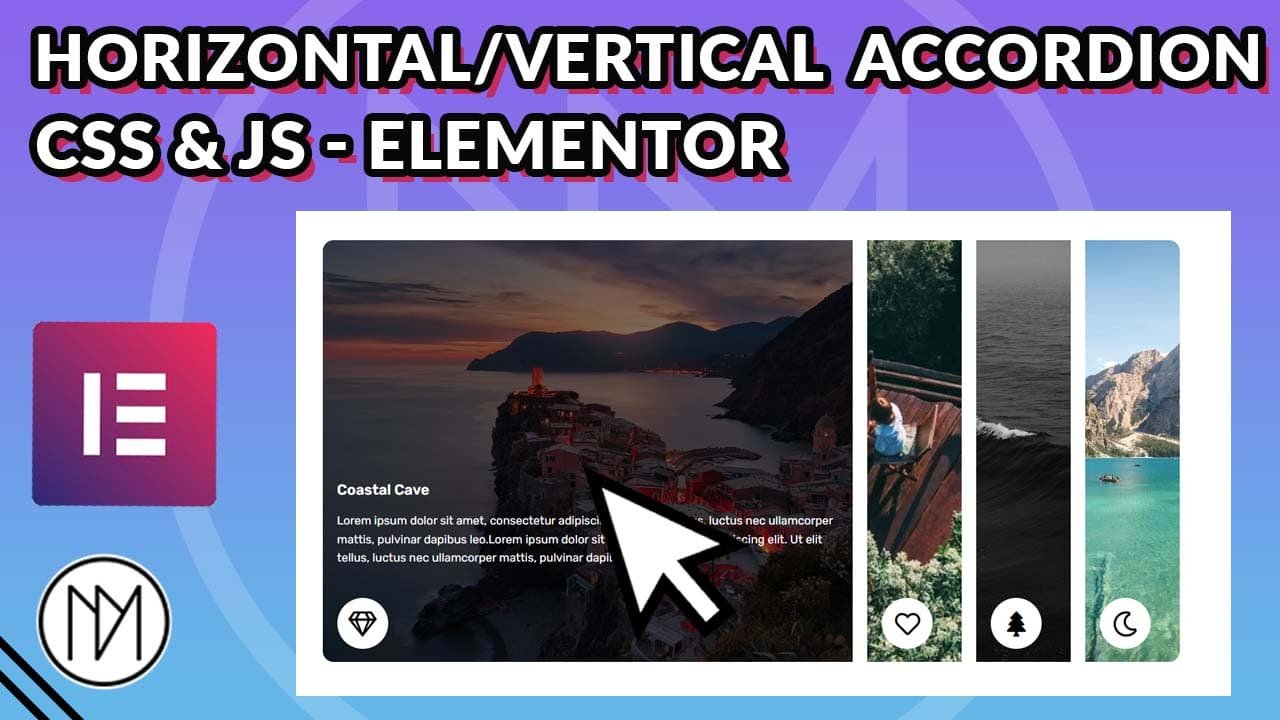
Clickable Horizontal/Vertical Accordion with Elementor & CSS/JS
- Give each accordion/column containers class “column“.
- Inside the column containers, give the class “inner-element” to the elements that needs to be hidden/shown. Make sure this elements have position: absolute, else the column containers would stretch to fit the content.
- The code works by adding expanded class to the column container that was clicked, making it use the CSS values given in CSS styles.
- Simply add your desired effect in .expanded CSS styling. Make sure to do it for both desktop and tablet/mobile, as in tablet/mobile we use height property instead of width.
- The inner-element is made visible/hidden by adding active class when the right column is clicked. Change the styling in .active class for your desired effect.
- If you wish to have any column Active by default. You can simply add the class “expanded” to column and also “active” to the inner-elements. So, the class for column would look like “column expanded” and for inside content, “inner-element active”.
- For Vertical Accordion, just remove the CSS code with media queries. Currently, we have different media queries added, so that on desktop it uses horizontal accordion and on tablet/mobile it uses vertical accordion. Simply, remove the code for desktop media query and also remove just the media query for tabet/mobile.
Coastal Cave
Lorem ipsum dolor sit amet, consectetur adipiscing elit. Ut elit tellus, luctus nec ullamcorper mattis, pulvinar dapibus leo.Lorem ipsum dolor sit amet, consectetur adipiscing elit. Ut elit tellus, luctus nec ullamcorper mattis, pulvinar dapibus leo.
Coastal Cave
Lorem ipsum dolor sit amet, consectetur adipiscing elit. Ut elit tellus, luctus nec ullamcorper mattis, pulvinar dapibus leo.Lorem ipsum dolor sit amet, consectetur adipiscing elit. Ut elit tellus, luctus nec ullamcorper mattis, pulvinar dapibus leo.
Coastal Cave
Lorem ipsum dolor sit amet, consectetur adipiscing elit. Ut elit tellus, luctus nec ullamcorper mattis, pulvinar dapibus leo.Lorem ipsum dolor sit amet, consectetur adipiscing elit. Ut elit tellus, luctus nec ullamcorper mattis, pulvinar dapibus leo.
Coastal Cave
Lorem ipsum dolor sit amet, consectetur adipiscing elit. Ut elit tellus, luctus nec ullamcorper mattis, pulvinar dapibus leo.Lorem ipsum dolor sit amet, consectetur adipiscing elit. Ut elit tellus, luctus nec ullamcorper mattis, pulvinar dapibus leo.
					<style>

    .column {

        transition: width 0.5s;
        overflow: hidden;
        height:600px;

    }

    /*Desktop over 1024px*/
    @media screen and (min-width: 1025px) {


    /*Clicked column styling*/
    .expanded {

    width: 150% !important;

    }
    }

    .expanded:after {

        content: '';
        background: rgba(0,0,0,0.5);
        position: absolute;
        left: 0;
        top: 0;
        height: 100%;
        width: 100%;
        z-index: 0;

    }

    /*Tablet and mobile, below 1025px*/
    @media (max-width: 1024px) {

    .column {

        transition: height 0.5s;
        height: 100px;

    }

    /*Clicked column styling*/
    .expanded {

         height: 500px !important;


    }
    }

    /*Inner elements inside column container styling*/
    .inner-element {

        opacity: 0;
        transition: opacity 0s;
        z-index: 2;


    }

    /*Inner elements made visible on clicked column*/
   .inner-element.active {


        opacity: 1;
        transition: opacity 0.5s 0.4s;


    }

</style>
<script>
    const columns = document.querySelectorAll('.column');
    const innerElements = document.querySelectorAll('.inner-element');

    columns.forEach(click => {
        click.addEventListener('click', event => {
            // Iterate over all columns
            columns.forEach(column => {
                if (column === click) {
                    // Set the clicked column width to 100%
                    column.classList.add('expanded');
                } else {
                    // Shrink the width of other columns
                    column.classList.remove('expanded');
                }
            });

            // Iterate over all inner elements
            innerElements.forEach(innerElement => {
                // Add the active class to the inner element of the clicked column
                if (innerElement.parentElement === click) {
                    innerElement.classList.add('active');
                } else {
                    innerElement.classList.remove('active');
                }
            });
        });
    });
</script>


