(This page includes affiliate links. If you click and purchase, I receive a small commission at no extra cost from you and that way you can support me. I only recommend tools that I have personally used and loved.)
Get Elementor Pro Today –
1 – Elementor Pro

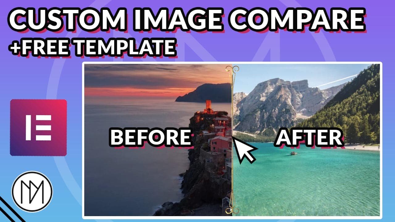
Custom Image Compare with Elementor Free, CSS & Javascript(JS)
Easily make image compare function with Elementor Page builder with fully responsive for all devices. You can use custom icons or image at the division of images.

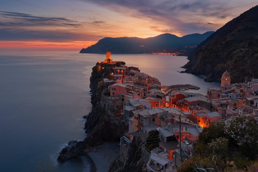
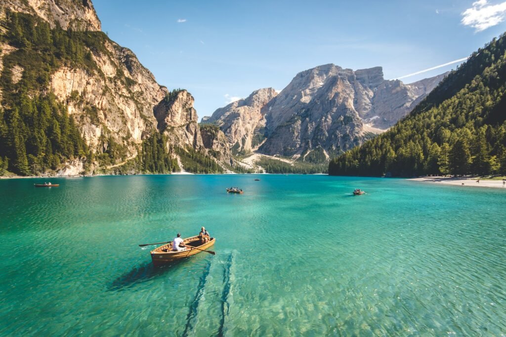
- Add “compare-before” CSS class to left image and “compare-after” to right image. For the divider image or icon, just add the CSS class “dm-range-icon“. If you are using Image, make sure to give it full-width(100%) in advanced tab (Refer video to understand), else the image will shrink at the right edge.
- The range input selector has been given class “imageCompare” in HTML.
- Make sure to give both images full-width(100%) in advanced tab.
- The size of the container is decided by the height of imageCompare::-webkit-slider-thumb, so we use different heights for all devices by using media queries.
- Add the below code in HTML widget at the bottom of the elements as we want the elements to load first then the code to run.
- We have to use appearance:none for imageCompare range input to remove the default styling so that we can style to our requirements.
					<input type="range" class="imageCompare" step="0.1">

<style>

    .compare-before {
      mask: linear-gradient(to right, #000 0, var(--pos, 50%), #0000 0);
    }

    .compare-after {
      mask: linear-gradient(to right, #0000 0, var(--pos, 50%), #000 0);
    }

    .compare-before, .compare-after {

        position: absolute;
        left: 50%;
        top:50%;
        transform: translate(-50%, -50%);
    }

    .imageCompare {


        width: 100%;
        appearance: none;
        background: transparent;
        cursor: pointer;

    }

    .imageCompare::-webkit-slider-thumb {

        appearance: none;
        width: 5px;
        height: 500px;
        background: transparent;
        margin-bottom: -10px;

    }

    @media(max-width:1024px) {

       .imageCompare::-webkit-slider-thumb {

        width: 5px;
        height: 450px;

    }
    }

    @media(max-width:767px) {

       .imageCompare::-webkit-slider-thumb {

        width: 5px;
        height: 200px;

    }
    }


    .dm-range-icon {

        position: absolute;
        left: 50%;
        top:50%;
        transform: translate(-50%, -50%);
        z-index: 5;
        pointer-events: none;

    }


</style>

<script>

    const before = document.querySelector('.compare-before');
    const after = document.querySelector('.compare-after');

    document.querySelector('.imageCompare').oninput = function() {
        before.style.setProperty('--pos', this.value + '%');
        after.style.setProperty('--pos', this.value + '%');
    };

   const rangeIcon = document.querySelector('.dm-range-icon');
   const imageCompare = document.querySelector('.imageCompare');

    imageCompare.addEventListener('input', function() {
    const rangeValue = this.value;
    rangeIcon.style.left = rangeValue + '%';
});

</script>