(This page includes affiliate links. If you click and purchase, I receive a small commission at no extra cost from you and that way you can support me. I only recommend tools that I have personally used and loved.)
For Better Website Use Custom CSS with –
1 – Elementor Pro

#1 – CSS code to make Flip Box
- Change transition: transform 1s; in both .dm-front-card & .dm-back-card to your desired flip animation duration. 1s stands for 1 second, so for faster animation, use lower values like 0.2s, 0.3s etc. For slower animation use higher value like 1.5s, 1.6s, 2s etc.
- For vertical card flip, change the rotateY to rotateX in all 3 locations in the below code.
- To change direction of the flip, simply switch the positive/negative value of 180deg on both sides. Make sure they are opposite to get clean flip animation.
- .dm-flip-card is the CSS class of the main container that contains 2 containers with CSS classes .dm-front-card & .dm-back-card. Both inner containers should be given position absolute to place on top of each other. Make sure to add same min-height to main container and its both inner containers (front & back card containers).
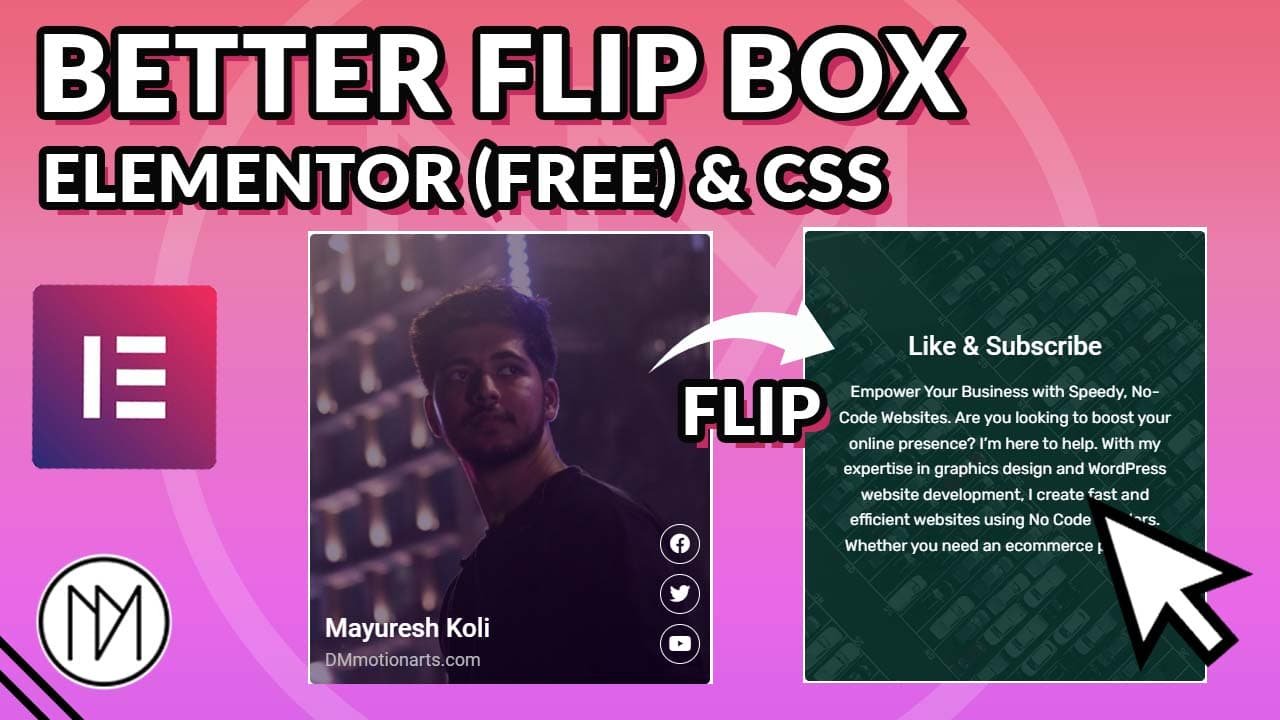
Like & Subscribe
Empower Your Business with Speedy, No-Code Websites. Are you looking to boost your online presence? I’m here to help. With my expertise in graphics design and WordPress website development, I create fast and efficient websites using No Code Builders. Whether you need an ecommerce platform,
					   .dm-flip-card {

        transform-style: preserve-3d;
        perspective: 2000px;

    }

    .dm-front-card {


        backface-visibility: hidden;
        transition: transform 1s; /*Flip Duration for front card*/


    }

    .dm-back-card {


        backface-visibility: hidden;
        transform:rotateY(180deg); /*Use rotateX for vertical flip, change to -180deg to change flip direction*/
        transition: transform 1s; /*Flip Duration for back card*/


    }

     .dm-flip-card:hover .dm-front-card {

        transform: rotateY(-180deg); /*Use rotateX for vertical flip, change to 180deg to change flip direction*/

    }

     .dm-flip-card:hover .dm-back-card {

        transform:rotateY(0deg); /*Use rotateX for vertical flip*/

    }
#2 – CSS code to make Parallax 3D Flip Box
- Change transition: transform 1s; in both .dm-front-card-3 & .dm-back-card-3 to your desired flip animation duration. 1s stands for 1 second, so for faster animation, use lower values like 0.2s, 0.3s etc. For slower animation use higher value like 1.5s, 1.6s, 2s etc.
- For vertical card flip, change the rotateY to rotateX in all 3 locations in the below code.
- To change direction of the flip, simply switch the positive/negative value of 180deg on both sides. Make sure they are opposite to get clean flip animation.
- .dm-flip-card-3 is the CSS class of the main container that contains 2 containers with CSS classes .dm-front-card-3 & .dm-back-card-3. Both inner containers should be given position absolute to place on top of each other. Make sure to add same min-height to main container and its both inner containers (front & back card containers).
- For the inner elements, example(in below design): the heading, subheading, social icons in front, and Heading and paragraph in back, you need to give it a CSS class. For example, for heading, I have given dm-flip-heading-3 as the CSS class.
Then in CSS code, you simply add transform: translate3D(5px, 0px, 50px); where the values are X,Y,Z respectively. The 3rd value (Z value) is how much above it is from base. So if you add high value(200px) then it will be above 200px from base.
This also leads to element looking a bit left or right (it is also dependent on perspective value), so you can change the X or Y value respectively to make it look normal.
Like & Subscribe
Empower Your Business with Speedy, No-Code Websites. Are you looking to boost your online presence? I’m here to help. With my expertise in graphics design and WordPress website development, I create fast and efficient websites using No Code Builders. Whether you need an ecommerce platform,
					   .dm-flip-card-3 {

        transform-style: preserve-3d;
        perspective: 2000px;

    }

    .dm-front-card-3 {

        transform-style: preserve-3d;
        backface-visibility: hidden;
        transition: transform 1s; /*Flip Duration for front card*/

    }


    .dm-back-card-3 {

        transform-style: preserve-3d;
        backface-visibility: hidden;
        transform:rotateY(180deg); /*Use rotateX for vertical flip, change to -180deg to change flip direction*/
        transition: transform 1s; /*Flip Duration for back card*/


    }

     .dm-flip-card-3:hover .dm-front-card-3 {

        transform: rotateY(-180deg); /*Use rotateX for vertical flip, change to 180deg to change flip direction*/

    }

     .dm-flip-card-3:hover .dm-back-card-3 {

        transform:rotateY(0deg);

    }

    /*Z-locations of inner elements*/

    .dm-flip-heading-3 {

        transform: translate3D(5px, 0px, 50px);

    }

    .dm-flip-subheading-3 {

        transform: translate3D(5px, 0px, 50px);

    }

    .dm-flip-social-3 {

        transform: translate3D(-5px, 0px, 50px);

    }

    .dm-flip-back-heading-3 {

         transform: translate3D(5px, 0px, 50px);


    }

    .dm-flip-back-subheading-3 {

         transform: translate3D(5px, 0px, 50px);


    }