(This page includes affiliate links. If you click and purchase, I receive a small commission at no extra cost from you and that way you can support me. I only recommend tools that I have personally used and loved.)
Get Elementor Pro Today –
1 – Elementor Pro

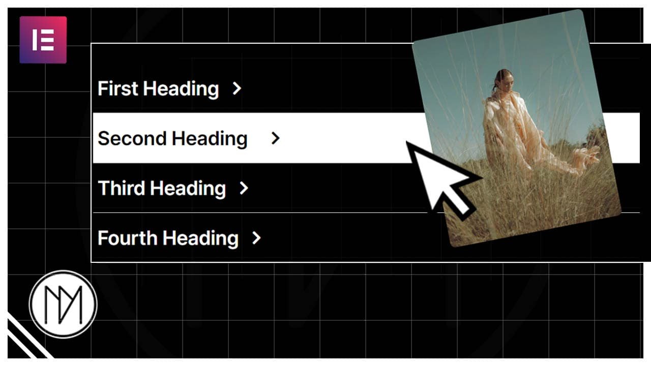
Modern and Advanced Portfolio Image Reveal Effect
With the below code, you can create any number of list with its own image. You can also change the delay of the image following making it faster or slower. Its fully customizable for changing rotation angle, opacity on hover and fully responsive.
First Heading
Second Heading
Third Heading
Fourth Heading
- .moving-container is the CSS class for the container which contains the image when hover.
- .dm-item is the CSS class of all the containers which make the moving-container visible when hovered on.
- .first-item, .second-item ….. – are the CSS classes for individual containers in the list.
- The moving-container has been given width of min(25%, 350px); which means that the width would be 25% but would never go above 350px.
- To add your own URL for images, simply replace the background-image: url to your image locations for :hover for all first-item, second-item etc.
- .moving-container has background set to transparent but you can give it a default color or default image if needed.
- In the javascript, you can change rotation angle in transform. (Check comments in code)
- If you don’t want delay you can remove it making the value 100 to 0 in setTImeout. (Check comment in code).
- You can also change setTimeout value to your requirement increasing or decreasing delay.
- Making the moving-container opacity 1 to something lower like 0.8 can give another trendy effect.
					<style>

    .moving-container{

        position: fixed;
        z-index: 9999;
        top:0;
        left:0;
        transition: 0.1;
        transform: translate(-50%, -50%);
        transition: transform 0.5s ease-in-out, background 0.3s, opacity 0.3s;
        pointer-events: none; /*Removes interaction on moving-container*/
        opacity: 0; /*Hide moving container by default*/
    }

    /*Default Image or Color of Moving Container*/
    .moving-container {

        /*background-image: url('https://dmmotionarts.com/wp-content/uploads/2024/01/anders-jilden-cYrMQA7a3Wc-unsplash.jpg');*/
        background-color: transparent;
        background-position: center center;
        background-size: cover;

    }

    /*Hide cursor when hover*/
    .dm-item {

        /*cursor: none;*/
    }

    /*Background Color of List item when hover*/
    .dm-item:hover {

        background: white;
    }

    /*Text Color*/
    .dm-list-text {

        color:white;
    }

     /*Text Color on Hover*/
    .dm-item:hover .dm-list-text {

        color:black;

    }

    /*Color and translate of Icon on hover*/
    .dm-item:hover .dm-list-icon .elementor-icon {

        color:black !important;
        transform: translate(20px,0px);

    }

    /*Make moving container visible on hover*/
    .dm-item:hover ~ .moving-container {
        opacity: 1;
    }

    /*Images shown on Moving Container*/
    .first-item:hover ~ .moving-container {
        background-image: url('https://dmmotionarts.com/wp-content/uploads/2024/03/pexels-ivan-xolod-8602123-3.jpg') !important;
    }

    .second-item:hover ~ .moving-container {
        background-image: url('https://dmmotionarts.com/wp-content/uploads/2024/03/pexels-luca-de-massis-8832685-3.jpg') !important;
    }

    .third-item:hover ~ .moving-container {
        background-image: url('https://dmmotionarts.com/wp-content/uploads/2024/03/pexels-ivan-xolod-8602123-3.jpg') !important;
    }

    .fourth-item:hover ~ .moving-container {
        background-image: url('https://dmmotionarts.com/wp-content/uploads/2024/03/pexels-luca-de-massis-8832685-3.jpg') !important;
    }

</style>


<script>
    let movingContainer = document.querySelector('.moving-container');
    let prevX = null;
    let idleTimeout;
    const threshold = 5; // Set a threshold for significant movement

    function handleMovement(x, y) {
        // Set container position
	setTimeout(() => {
        movingContainer.style.top = y + 'px';
        movingContainer.style.left = x + 'px';
	},100); //Make this 0 to remove delay when following

        if (prevX !== null) {
            let deltaX = x - prevX;

            // Apply rotation only if the movement exceeds the threshold
            if (Math.abs(deltaX) > threshold) {
                if (deltaX > 0) {
                    // Moves right
                    movingContainer.style.transform = 'translate(-50%, -50%) rotate(25deg)';
                } else if (deltaX < 0) {
                    // Moves left
                    movingContainer.style.transform = 'translate(-50%, -50%) rotate(-25deg)';
                }
            }
        }

        // Clear the previous timeout if it exists
        clearTimeout(idleTimeout);

        // Set a timeout to reset the rotation if no movement is detected
        idleTimeout = setTimeout(() => {
            movingContainer.style.transform = 'translate(-50%, -50%) rotate(0deg)';
        }, 20); // Adjust the timeout duration as needed

        // Update the previous X position with the current position
        prevX = x;
    }

    document.addEventListener('mousemove', (event) => {
        handleMovement(event.clientX, event.clientY);
    });

    document.addEventListener('touchmove', (event) => {
        let touch = event.touches[0];
        handleMovement(touch.clientX, touch.clientY);
    });

    document.addEventListener('touchstart', (event) => {
        let touch = event.touches[0];
        handleMovement(touch.clientX, touch.clientY);
    });
</script>