Don’t want to make from scratch? Get the template instead 🙂
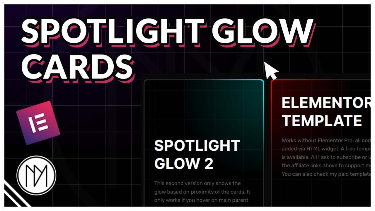
Introduction – Spotlight Hover Glowing Cards with Elementor, CSS and JS Code
In this tutorial, we will create two different versions of glowing cards. First version only shows the effect when you hover on the cards. The second version shows glow effect based on the proximity of your mouse cursor.
Layout for containers or DIV:
SpotLight Glow
This first version only shows the glow when you hover over the card. Easy to make and customize. Simply change the color or add a pattern in glow by changing the background overlay.
elementor template
Works without Elementor Pro, all code is added via HTML widget. A free template is available. All I ask to subscribe or use the affiliate links above to support me. You can also check my paid templates.
youtube tutorial
Make from scratch with my youtube tutorial. You can also watch the tutorial to learn about customization available and how it works.
Version 1 – Spotlight Glow Cards On Hover Only
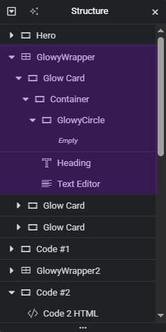
- dm-glow-card is the CSS class of the card container. This should have low padding like 2px, 3px, as this container acts as the edge of the cards. It has been given border radius of 10px in code, you can remove or change it.
- Add Extra Container/DIV inside dm-glow-card. This container needs to have a background color so that it blocks the dm-glow-card and only shows the padding area. Give it GROW in advanced panel so that it takes full size. This container should contain all your text or content.
- dm-glowy-circle is the CSS class of the container that is inside the extra container. This container shows the inside glow of the container. You need to make this have radial gradient with low opacity.
- height and width in dm-glowy-circle controls the size of inner glow.
- background:radial-gradient has been given 250px as radius, this controls the color of the edge of the cards.
- card1, card2, card3 is extra CSS class that you give to your dm-glowy-circle container. This is needed if you want to have different colors for each cards. To add more cards like card4, card5 etc., you can simply copy the card code in the CSS below (It is commented in the code) and change the number.
- You can also remove or change the move up effect that happens on hover by removing/changing the code at Line 83 below.
					<style>

    /*Glowing Circle*/

    .dm-glowy-circle {

        height: 500px;
        width: 500px;

        transform: translate(-50%, -50%);
        transition: opacity 0.3s;
        pointer-events: none;
        /*mix-blend-mode: screen;*/
    }

    /*Edge Glow Color*/

    .dm-glow-card {

        border-radius: 10px;


		transition: 0.3s;

    }


   /*Glowing Circle is invisible when not hovered*/

    .dm-glowy-circle {

        opacity: 0;
    }

    .dm-glow-card:hover .dm-glowy-circle {

        opacity: 1;

    }

    /*Card 1 Color*/

    .dm-glow-card.card1:hover {


     background: radial-gradient(
				250px circle at var(--xPos) var(--yPos),
				rgba(0, 255, 241, 1),
				transparent 80%
			);
    }

     /*Card 2 Color*/
    .dm-glow-card.card2:hover {


     background: radial-gradient(
				250px circle at var(--xPos) var(--yPos),
				rgba(255, 0, 0, 1),
				transparent 80%
			);
    }

     /*Card 3 Color*/
    .dm-glow-card.card3:hover {


     background: radial-gradient(
				250px circle at var(--xPos) var(--yPos),
				rgba(0, 255, 0, 1),
				transparent 80%
			);
    }


    /* Move Card Up on Hover*/

    .dm-glow-card:hover {

        transform:translateY(-20px);

    }

</style>

<script>

const dmGlowCards = document.querySelectorAll('.dm-glow-card');

dmGlowCards.forEach(card => {
  const dmGlowCircle = card.querySelector('.dm-glowy-circle');

  card.addEventListener('mousemove', (e) => {
    const rect = card.getBoundingClientRect();
    const x = e.clientX - rect.left;
    const y = e.clientY - rect.top;


        dmGlowCircle.style.left = `${x}px`;
        dmGlowCircle.style.top = `${y}px`;

        card.style.setProperty("--xPos", `${x}px`);
        card.style.setProperty("--yPos", `${y}px`);
  });

  card.addEventListener('mouseleave', () => {

    //When mouse leaves

  });
});

</script>
SpotLight Glow
This second version only shows the glow based on proximity of the cards. Easy to make and customize. Simply change the color or add a pattern in glow by changing the background overlay.
elementor template
Works without Elementor Pro, all code is added via HTML widget. A free template is available. All I ask to subscribe or use the affiliate links above to support me. You can also check my paid templates.
youtube tutorial
Make from scratch with my youtube tutorial. You can also watch the tutorial to learn about customization available and how it works.
Version 2a – Proximity Spotlight Glow Cards ( Type 1: Required Hover on Main Wrapper Container)
- dm-glowy-wrapper-2 is the CSS class of the container that contains the cards. The proximity only works inside this container for this version, for different version check Type 2 below.
- dm-glow-card-2 is the CSS class of the card container. This should have low padding like 2px, 3px, as this container acts as the edge of the cards. It has been given border radius of 10px in code, you can remove or change it.
- Add Extra Container/DIV inside dm-glow-card. This container needs to have a background color so that it blocks the dm-glow-card-2 and only shows the padding area. Give it GROW in advanced panel so that it takes full size. This container should contain all your text or content.
- dm-glowy-circle-2 is the CSS class of the container that is inside the extra container. This container shows the inside glow of the container. You need to make this have radial gradient with low opacity.
- height and width in dm-glowy-circle-2 controls the size of inner glow.
- background:radial-gradient has been given 250px as radius, this controls the color of the edge of the cards.
- card1, card2, card3 is an extra CSS class that you give to your dm-glowy-circle-2 container. This is needed if you want to have different colors for each cards. To add more cards like card4, card5 etc., you can simply copy the card code in the CSS below (It is commented in the code) and change the number.
- You can also remove or change the move up effect that happens on hover by removing/changing the code at Line 74 below.
					<style>

    /*Hide Glowing Circle when outside wrapper*/

    .dm-glowy-wrapper-2 .dm-glowy-circle-2 {

        opacity: 0;
        pointer-events: none;
    }

    /*Glowing Circle*/
    .dm-glowy-wrapper-2:hover .dm-glowy-circle-2 {

        height: 500px;
        width: 500px;
        transform: translate(-50%, -50%);
        transition: opacity 0.3s;
        opacity: 1;
    }

    /*Glow Card Edge Color*/
    .dm-glow-card-2 {

        border-radius: 10px;

		transition: 0.3s;

    }


    /*Card 1*/

    .dm-glow-card-2.card1 {

     background: radial-gradient(
				250px circle at var(--xPos) var(--yPos),
				rgba(0, 255, 241, 1),
				transparent 80%
			);
    }

    /*Card 2*/

    .dm-glow-card-2.card2 {


     background: radial-gradient(
				250px circle at var(--xPos) var(--yPos),
				rgba(255, 0, 0, 1),
				transparent 80%
			);
    }

    /*Card 3*/

    .dm-glow-card-2.card3 {


     background: radial-gradient(
				250px circle at var(--xPos) var(--yPos),
				rgba(0, 255, 0, 1),
				transparent 80%
			);
    }

    /*Move Card Up On Hover*/

    .dm-glow-card-2:hover {

        transform:translateY(-20px);

    }

</style>


<script>

const dmGlowWrappers2 = document.querySelectorAll('.dm-glowy-wrapper-2');

dmGlowWrappers2.forEach(wrapper => {
  wrapper.addEventListener('mousemove', (e) => {
    const cards = wrapper.querySelectorAll('.dm-glow-card-2');

    cards.forEach((card) => {
      const glow = card.querySelector('.dm-glowy-circle-2');
      const rect = card.getBoundingClientRect();

      const x = e.clientX - rect.left;
      const y = e.clientY - rect.top;

      glow.style.left = `${x}px`;
      glow.style.top = `${y}px`;

      card.style.setProperty("--xPos", `${x}px`);
      card.style.setProperty("--yPos", `${y}px`);
    });
  });
});

</script>
SpotLight Glow 3
This third version only shows the glow based on proximity of the cards. The glow follow is happening even when your outside the main wrapper container. Good for projects where the proximity is required without hover on main container.
elementor template
Works without Elementor Pro, all code is added via HTML widget. A free template is available. All I ask to subscribe or use the affiliate links above to support me. You can also check my paid templates.
youtube tutorial
Make from scratch with my youtube tutorial. You can also watch the tutorial to learn about customization available and how it works.
Version 2b – Proximity Spotlight Glow Cards ( Type 2: Does not require hover on Main Wrapper Container)
- All customization is same as the above type 1 version. You can skip adding wrapper CSS class, adding it would do no changes either way.
- Simply all CSS classes are same as Type 1 above but with -3 suffix.
					<style>

     /*Make glowy circle not clickable*/

    .dm-glowy-circle-3 {

        pointer-events: none;

    }

    /*Glowing Circle*/

    .dm-glowy-circle-3 {

        height: 500px;
        width: 500px;
        transform: translate(-50%, -50%);
        transition: opacity 0.3s;
        opacity: 1;
    }

    /*Glow Card Edge Color*/

    .dm-glow-card-3 {
        border-radius: 10px;

        transition: 0.3s;
    }

    /*Card 1*/

    .dm-glow-card-3.card1 {
        background: radial-gradient(
            250px circle at var(--xPos) var(--yPos),
            rgba(0, 255, 241, 1),
            transparent 80%
        );
    }

    /*Card 2*/

    .dm-glow-card-3.card2 {
        background: radial-gradient(
            250px circle at var(--xPos) var(--yPos),
            rgba(255, 0, 0, 1),
            transparent 80%
        );
    }

    /*Card 3*/

    .dm-glow-card-3.card3 {
        background: radial-gradient(
            250px circle at var(--xPos) var(--yPos),
            rgba(0, 255, 0, 1),
            transparent 80%
        );
    }

    /*Move Card Up On Hover*/

    .dm-glow-card-3:hover {
        transform: translateY(-20px);
    }

</style>


<script>

const cards = document.querySelectorAll('.dm-glow-card-3');

  document.addEventListener('mousemove', (e) => {

    cards.forEach((card) => {
      const glow = card.querySelector('.dm-glowy-circle-3');
      const rect = card.getBoundingClientRect();

      const x = e.clientX - rect.left;
      const y = e.clientY - rect.top;

      glow.style.left = `${x}px`;
      glow.style.top = `${y}px`;

      card.style.setProperty("--xPos", `${x}px`);
      card.style.setProperty("--yPos", `${y}px`);
    });

});


</script>