
(This page includes affiliate links. If you click and purchase, I receive a small commission at no extra cost from you and that way you can support me. I only recommend tools that I have personally used and loved.)
Requirements for Attention Grabber Animation in Elementor –
1 – Elementor Pro (Custom CSS) OR
2 – Any Alternative CSS Option

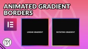
We will be making below Animated Gradient Background.

gcontainer is the css class used for the gradient container.
background-size is used to scale the gradient to higher size than the actual container.
You can create your own gradient here – https://cssgradient.io
					.gcontainer::after {
    content: '';
    position: absolute;
    height: 100%;
    width: 100%;
    top:0;
    left:0;
  background: linear-gradient(-50deg, rgba(0, 191, 255, 0.5), rgba(148, 0, 211, 0.5), rgba(0, 0, 255, 0.5));
  background-size: 150% 150%;
  animation: gradient-animation 3s ease infinite;
  z-index: 2;
  border-radius: 25px;
}

@keyframes gradient-animation {
  0% {
    background-position: 0% 50%;
  }
  50% {
    background-position: 100% 50%;
  }
  100% {
    background-position: 0% 50%;
  }
}
					.gcontainer2::after {
    content: '';
    position: absolute;
    height: 100%;
    width: 100%;
    top: 0;
    left: 0;
    background: linear-gradient(-60deg, rgba(75, 0, 130, 0.5), rgba(128, 0, 128, 0.5), rgba(75, 0, 130, 0.5));
    background-size: 250% 250%;
    animation: gradient-animation 3s ease infinite;
    z-index: 2;
    border-radius: 25px;
}

@keyframes gradient-animation {
    0% {
        background-position: 0% 50%;
    }
    50% {
        background-position: 100% 50%;
    }
    100% {
        background-position: 0% 50%;
    }
}