(This page includes affiliate links. If you click and purchase, I receive a small commission at no extra cost from you and that way you can support me. I only recommend tools that I have personally used and loved.)
Requirements –
1 – Elementor Pro

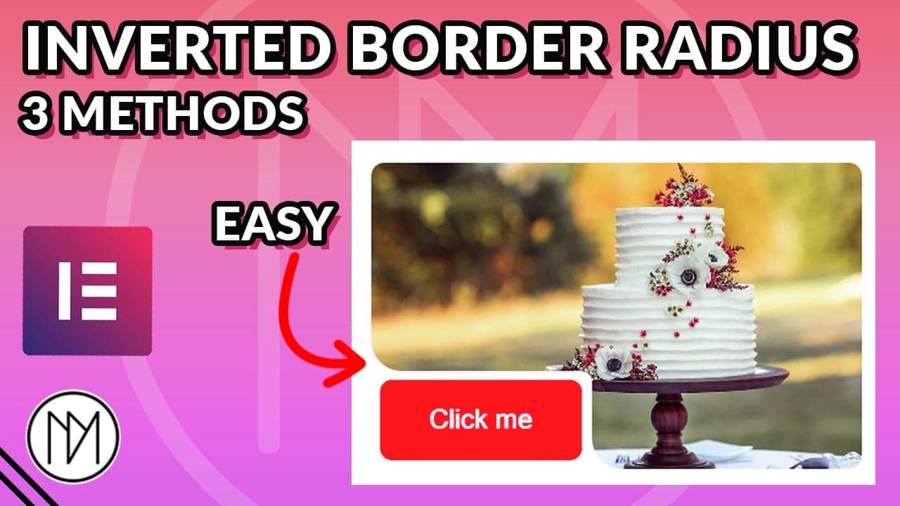
Inverted Border Radius with SVG or CSS
We cannot simply add inverted border radius as it’s not possible with CSS but instead we use different methods to give illusion of inverted border radius. Below are different methods that can be used to create inverted border-radius. We simply create the curved shape and place it at appropriate location which leads to illusion of inverted border-radius.
Method 1 - Using Pseudo Classes ( Does not work with Elementor)
- Reminder: This method is the most common way to make inverted border radius but unfortunately, it does not work well with Elementor because we require both pseudo classes (before & after). Elementor allows us to use :after pseudo class and we can get one corner as inverted border radius but we cannot work with :before pseudo class as Elementor has already added :before pseudo class to all containers. These already added :before pseudo class is used by Elementor to add background image, overlay, videos in containers.
- This method is for people who want to use coding or other page builders which allow to use both before and after pseudo class.
- Below code adds illusion of inverted border-radius by creating a transparent circle and using the box shadow as the visible element.
- Based on where you want to show the inverted border-radius, you will need to use appropriate left, right, top, bottom values along with appropriate box-shadow.
- Make sure the parent div has overflow:hidden to remove the extra shadow.
- In below code, “curved-container” is the CSS class used for the element.
left: 100%;
top:0;
top:100%;
left:0;
box-shadow: -25px -25px white;
right: 100%;
top:0;
top: 100%;
right:0;
box-shadow: 25px -25px white;
left: 100%;
bottom:0;
bottom: 100%;
left:0;
box-shadow: -25px 25px white;
right: 100%;
bottom:0;
bottom: 100%;
right:0;
box-shadow: 25px 25px white;
					/*Inverted border-radius */

.curved-container:after {

    content: '';
    background: transparent;
    width: 50px;
    height: 50px;
    position: absolute;
    right: 0;
    bottom:100%;
    border-radius: 50%;
    box-shadow: 25px 25px white;

}

.curved-container:before {

    content: '';
    background: transparent;
    width: 50px;
    height: 50px;
    position: absolute;
    right: 0;
    bottom:100%;
    border-radius: 50%;
    box-shadow: 25px 25px white;

}
Method 2 - Using SVG code
- To increase the size of inverted border-radius, replace all “25” number with your desired size.
- To change the color, add your desired hex code color in fill=”#YOURCOLORHERE”
- Don’t forget to add position:absolute; and give appropriate top, right, left or bottom values. Refer above for values.
					Top Left Inverted Border-Radius

<svg width="25" height="25">
  <path d="M0,25 L0,0 L25,0 A25,25 0 0,0 0,25 Z" fill="white" />
</svg>

Top Right Inverted Border-Radius

<svg width="25" height="25">
  <path d="M25,25 L25,0 L0,0 A25,25 0 0,1 25,25 Z" fill="white" />
</svg>

Bottom Left Inverted Border-Radius

<svg width="25" height="25">
  <path d="M0,0 L0,25 L25,25 A25,25 0 0,1 0,0 Z" fill="white" />
</svg>

Bottom Right Inverted Border-Radius

<svg width="25" height="25">
  <path d="M25,0 L25,25 L0,25 A25,25 0 0,0 25,0 Z" fill="white" />
</svg>
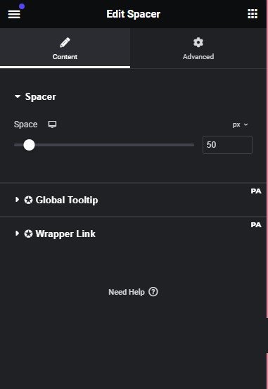
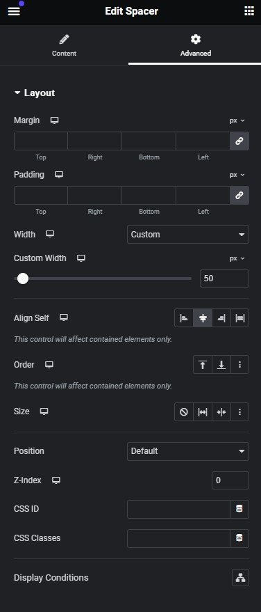
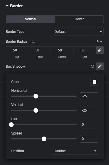
3. Using Spacer Widget (Elementor Only)
- Using spacer is another alternative if you don’t want to work with code.
- Simply make the size of spacer to your desired size by changing space value and custom width value. Make sure you switch it to ‘px’ when using values.
- Now simply change the Box shadow horizontal and vertical values to half of your selected size. Simply using positive and negative values will change the position of inverted border-radius.
- Add overflow hidden to the parent container if you don’t have Elementor Pro.
- To even make it better add the overflow:hidden to Custom CSS (Requires Elementor Pro).
					selector {

    overflow:hidden;

}