(This page includes affiliate links. If you click and purchase, I receive a small commission at no extra cost from you and that way you can support me. I only recommend tools that I have personally used and loved.)
Don’t want to make from scratch? Buy the template instead 🙂
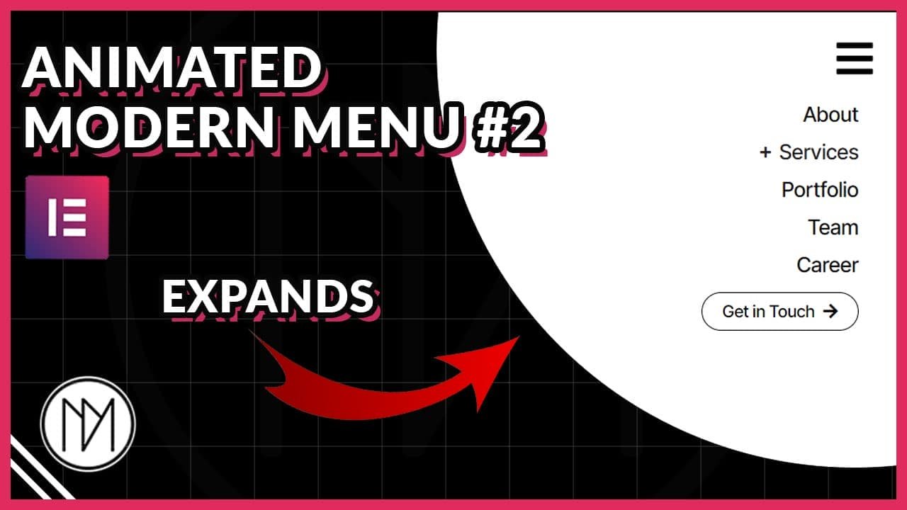
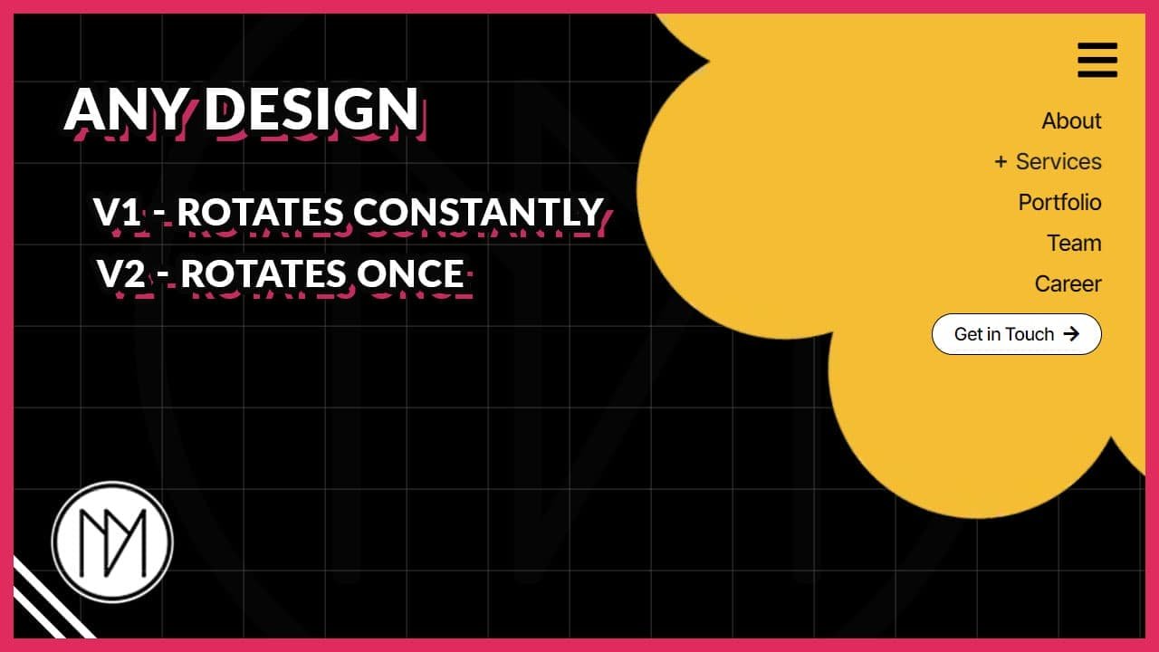
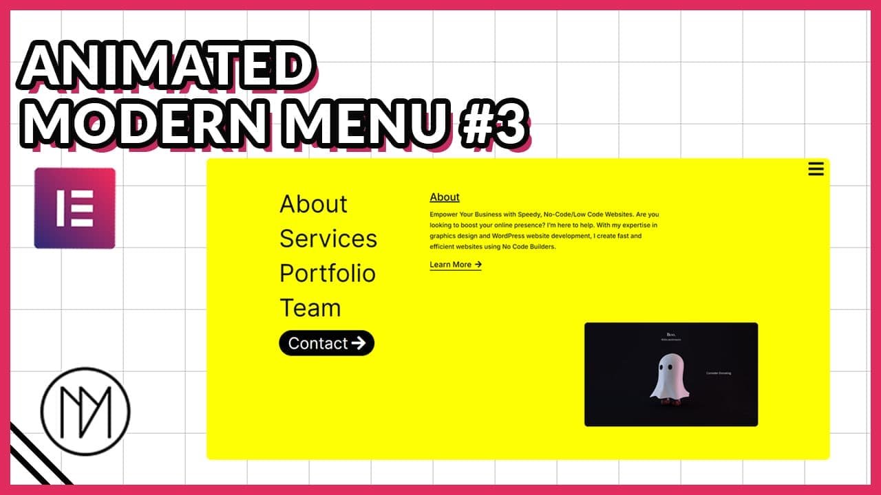
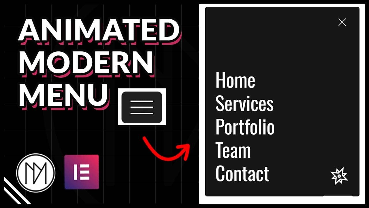
Introduction – Animated Modern Menu with Elementor & GSAP
In this tutorial, we are learning to make simple and minimalistic menu that also looks modern with the animations. It is fully responsive and enhances your website by making it look more livelier.
Animated Hamburger Icon (Toggle between Open and Close Icon)
- Refer to this video to understand it better. (https://youtu.be/FzcW342IJ-c?t=202)
- Width in .menu-icon6 changes width of the hamburger icon.
- height in .menu-icon6 changes the distance between each line.
- height in .line6 changes the thickness of the each lines.
- .menu-wrapper6 contains the styling for background, padding, border etc.
- Each CSS class has an .active state, change the appropriate values for background, border etc.
					<div class="menu-wrapper6" id="menu-wrapper6">
    <div id="menu-icon6" class="menu-icon6">
        <div class="line6 top6"></div>
        <div class="line6 middle6"></div>
        <div class="line6 bottom6"></div>
    </div>
</div>

<style>
 :root {
     --dm-normal-delay: 0.5s;
     --dm-active-delay: 0s;
     --dm-menu-transition: 0.3s;
 }

 .menu-icon6 {
    width: 50px;
    height: 30px;
    position: relative;
    cursor: pointer;
    transition: transform var(--dm-menu-transition) ease;
    transition-delay: var(--dm-normal-delay);
}

.line6 {
    width: 100%;
    height: 3px;
    background-color: white;
    position: absolute;
    transition: all var(--dm-menu-transition) ease;
    transition-delay: var(--dm-normal-delay);
}

.top6 {
    top: 0;
    transition-delay: var(--dm-normal-delay);
}

.middle6 {
    top: 50%;
    transform: translateY(-50%);
    transition-delay: var(--dm-normal-delay);
}

.bottom6 {
    bottom: 0;
    transition-delay: var(--dm-normal-delay);
}

.menu-wrapper6 {
    padding: 10px;
    /*border: 2px solid black;*/
    transition: all var(--dm-menu-transition) ease;
    /*background: white;*/
    transition-delay: var(--dm-normal-delay);
}

.menu-wrapper6.active6 .menu-icon6 {
    transform: rotate(360deg);
    transition-delay: var(--dm-active-delay);
}

.menu-wrapper6.active6 .top6 {
    transform: rotate(45deg);
    top: 50%;
    transform: translateY(-50%) rotate(45deg);
    background-color: white;
    transition-delay: var(--dm-active-delay);
}

.menu-wrapper6.active6 .middle6 {
    opacity: 0;
    transition-delay: var(--dm-active-delay);
}

.menu-wrapper6.active6 .bottom6 {
    transform: rotate(-45deg);
    bottom: 50%;
    transform: translateY(50%) rotate(-45deg);
    background-color: white;
    transition-delay: var(--dm-active-delay);
}

.menu-wrapper6.active6 {
    padding: 10px;
    /*border: 2px solid white;*/
    transition-delay: var(--dm-active-delay);
    /*background: black;*/
}

</style>

<script>
document.getElementById('menu-wrapper6').addEventListener('click', function() {
    this.classList.toggle('active6');
});
</script>
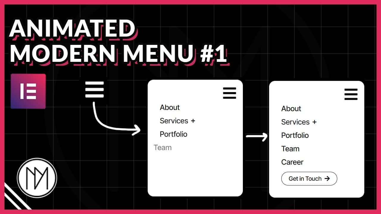
Minimal Style Menu Code – CSS and Javascript (JS)
- dm-menu-6-bg is the CSS of the parent container of all contents of menu.
- dm-menu-icon-6 is the CSS class of the menu icon.
- dm-menu-6-title is the CSS class of the menu titles (heading widget with p HTML tag).
- dm-menu-6-spin is the CSS class of image or icon that has the animation of spinning. You can change to any animation via CSS keyframes in below code.
- From line 103 – 119, please change the values for desktop, tablet and mobile for “closed” menu. (Please refer above video to know how to do it perfectly)
					<script src="https://cdnjs.cloudflare.com/ajax/libs/gsap/3.12.5/gsap.min.js" integrity="sha512-7eHRwcbYkK4d9g/6tD/mhkf++eoTHwpNM9woBxtPUBWm67zeAfFC+HrdoE2GanKeocly/VxeLvIqwvCdk7qScg==" crossorigin="anonymous" referrerpolicy="no-referrer"></script>

<style>

  .dm-menu-icon-6 {

      transition: none !important;
  }

  .dm-menu-6-bg {

      height: calc(100vh - 20px);
      transition: none !important;

  }

  /*Removes transition that elementor has added for links*/

  .dm-menu-6-title a {

     transition: none !important;

  }


  .dm-menu-6-title {

      transition: letter-spacing 0.3s;

  }

  .dm-menu-6-title:hover {

      letter-spacing: 10px;

  }

  .dm-menu-6-spin {

      animation: dmSpin 10s linear infinite;
      animation-play-state: paused;

  }

  @keyframes dmSpin {

  from {
    transform: rotate(0deg);
  }
  to {
    transform: rotate(360deg);
  }

    /*Hides scrollbar in webkit browsers like chrome etc*/
    .dm-menu-6-bg::-webkit-scrollbar {

        width: 0px;
    }

    /*Hide scrollbar for firefox*/

        .dm-menu-6-bg {

         scrollbar-width: none;

    }

</style>

<script>

    const dmMenuIcon6 = document.querySelector('.dm-menu-icon-6');
    const dmMenu6BG = document.querySelector('.dm-menu-6-bg');
    const dmMenu6Titles = document.querySelectorAll('.dm-menu-6-title');

    let dmMenu6Active = false;

    const dmMenu6Timeline = gsap.timeline();

    dmMenu6Timeline.pause();


  dmMenuIcon6.addEventListener('click', () => {

    if(dmMenu6Active) {

        dmMenu6Timeline.reverse();

    }

    else {

        dmMenu6Timeline.play();


    }

    dmMenu6Active = !dmMenu6Active;


  });

  /*Responsive Absolute values*/

    let dmMenuRight6, dmMenuTop6;

    if (window.innerWidth >= 1024) {
        // Desktop
        dmMenuRight6 = '50px';
        dmMenuTop6 = '50px';
    } else if (window.innerWidth >= 767) {
        // Tablet
        dmMenuRight6 = '50px';
        dmMenuTop6 = '50px';
    } else {
        // Mobile
        dmMenuRight6 = '10px';
        dmMenuTop6 = '10px';
    }


  /*Gsap Animation*/

  dmMenu6Timeline.from(dmMenu6BG, {

     right: dmMenuRight6,
     top: dmMenuTop6,
     width: '90px',
     height: '70px',
     duration: 1,
     ease:'power3.inOut'

  });

  dmMenu6Timeline.from('.dm-menu-6-title', {

     y: 50,
     opacity: 0,
     duration: 0.2,
     ease:'power2.inOut',
     stagger: 0.1

  },'-=0.2');

  dmMenu6Timeline.from('.dm-menu-6-spin', {

      opacity:0,
      duration:0.3,
      onComplete: () => {
        document.querySelector('.dm-menu-6-spin').style.animationPlayState = 'running';
    }


  },'-=0.2');


</script>