(This page includes affiliate links. If you click and purchase, I receive a small commission at no extra cost from you and that way you can support me. I only recommend tools that I have personally used and loved.)
Requirements –
1 – Elementor Pro
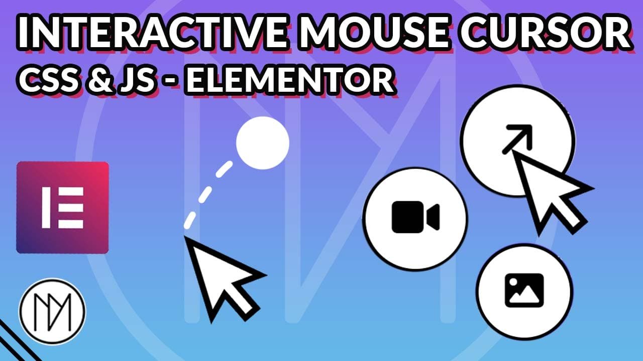
Try Hovering On Below Button, Image, Video. (The video hover might not work as it is embedded from youtube)

HTML, CSS, JS code to create Interactive trail on mouse cursor
- Add “item” CSS class to the elements that require interactive scale and icon showing.
- Give the elements that require interaction a data-type = “image” or data-type = “video” (Example : <div class=”item” data-type=”image”> Your content here </div>) . If you’re using Elementor, then add in “Attribute” panel in the advanced tab – data-type|video or data-type|image. This would make the appropriate icon visible on item class elements.
- This code adds 3 icons but if you wish to add more icons and interaction, please scroll down to the appropriate section.
					<div class="custom-cursor">
<div class="image-icon" > <i class="fa-solid fa-image"></i> </div>
<div class="video-icon" > <i class="fa-solid fa-video"></i> </div>
<div class ="link-icon"> <i class="fa-solid fa-arrow-right fa-rotate-by" style="--fa-rotate-angle: -45deg;"></i> </div>
</div>


<style>

    /*Hide Mouse on website*/
   /* body{

    cursor: none;

    }
    */

    /*Hide mouse on item elements*/
    .item {

        cursor: none;
    }

     /*Circle Styling*/
    .custom-cursor {

      pointer-events:none;
      width:150px;
      height:150px;
      background:white;
      border-radius: 50%;
      display:flex;
      justify-content:center;
      align-items:center;
      position:fixed;
      transform: translate(-50%, -50%) scale(0.20);
      transition: opacity 0.3s, transform 0.3s;
      opacity:0;
      z-index:9999999;
    }

    /*Icons Styling*/
    .video-icon, .image-icon, .link-icon
    {
      color:black;
      font-size: 60px;
      position:absolute;
      left:50%;
      top:50%;
      transform:translate(-50%, -50%);
      opacity:0;

    }


</style>


<script>

    const customCursor = document.querySelector('.custom-cursor')
    const items = document.querySelectorAll('.item');
    const videoIcon = document.querySelector('.video-icon');
    const imageIcon = document.querySelector('.image-icon');
    const linkIcon = document.querySelector('.link-icon');

    //Fade In when entering viewport, 200ms delay added to remove glitchiness
    document.addEventListener('mouseenter', () => {

      setTimeout(() => {
         customCursor.style.opacity = 1;

      },200);

    });

    //Fade Out when mouse leaves viewport
    document.addEventListener('mouseleave', () => {

      customCursor.style.opacity = 0;

    });

    //Circle Follows Mouse with 100ms delay
    document.addEventListener('mousemove', e => {

      setTimeout(() => {

      customCursor.style.top = e.clientY + 'px';
      customCursor.style.left = e.clientX + 'px';

      },100); //0ms if no delay needed

    });

    //Hover effects on item class
    items.forEach(item => {

      item.addEventListener('mouseenter', () => {

        //Scale when hovered on item class
        customCursor.style.transform = 'translate(-50%, -50%) scale(1)';

        //Check data-type and make the icon visible only for that icon
        if(item.dataset.type === 'video') {

          videoIcon.style.opacity = 1;

        }
        else if(item.dataset.type === 'image') {

          imageIcon.style.opacity = 1;

        }
        else if(item.dataset.type === 'link') {

          linkIcon.style.opacity = 1;

        }

      });

    });

    //Hover out of item class
    items.forEach(item => {

      item.addEventListener('mouseleave', () => {

        //Return to default size when not hovered
        customCursor.style.transform = 'translate(-50%,-50%) scale(0.20)';
        //Hide all icons when not hovered
         videoIcon.style.opacity = 0;
         imageIcon.style.opacity = 0;
         linkIcon.style.opacity = 0;

      });

    });


</script>
Adding More Interactive Icons and Interactive Types
- Add new div (inside div class=”custom-cursor”) with the new icon and new class. In this example, we give it a class called “custom-icon”.
- Make sure you add data-type = “custom” or data-type|custom (in Elementor) attribute to the desired element along with item class.
- Here we are using the word “custom”, you can add any name.
					<div class="custom-cursor">

<div class="custom-icon"> <i class="fas fa-plus"></i> </div>

</div>
Add your new custom CSS class with the old icons styling, or create new one with the same styling. Pro tip: If you have different styling for each icon, you can add common styling in a grouped CSS (version 1 below) and only use the separate styling in individual CSS styling. Example: .video-icon { margin-left: 20px;) -> This would add margin-left to video-icon but it will also use the grouped CSS properties like left, top etc.
					/*Version 1 - giving same styling*/

.video-icon, .image-icon, .link-icon, .custom-icon
    {
      color:black;
      font-size: 60px;
      position:absolute;
      left:50%;
      top:50%;
      transform:translate(-50%, -50%);
      opacity:0;

    }


/*Version 2 - Create seperate styling for more controls*/

.custom-icon
   {
      color:black;
      font-size: 60px;
      position:absolute;
      left:50%;
      top:50%;
      transform:translate(-50%, -50%);
      opacity:0;

    }
- Add your custom icon class in your javascript. (const customIcon = document.querySelector(‘.custom-icon’);
- For hover effect and showing it only on ‘custom’ data-type, add else if statement, and change item-dataset.type === ‘custom’.
- For out of hover effect, add customIcon.style.opacity = 0, so that it hides when not hovered on item class.
    const customIcon = document.querySelector('.custom-icon');

     //Hover effects on item class
    items.forEach(item => {

      item.addEventListener('mouseenter', () => {

        //Scale when hovered on item class
        customCursor.style.transform = 'translate(-50%, -50%) scale(1)';

        //Check data-type and make the icon visible only for that icon
        if(item.dataset.type === 'video') {

          videoIcon.style.opacity = 1;

        }
        else if(item.dataset.type === 'image') {

          imageIcon.style.opacity = 1;

        }
        else if(item.dataset.type === 'link') {

          linkIcon.style.opacity = 1;

        }

        //Add your Custom icon with else if
       else if(item.dataset.type === 'custom') {

          customIcon.style.opacity = 1;

        }


      });

    });

    //Hover out of item class
    items.forEach(item => {

      item.addEventListener('mouseleave', () => {

        //Return to default size when not hovered
        customCursor.style.transform = 'translate(-50%,-50%) scale(0.20)';
        //Hide all icons when not hovered
         videoIcon.style.opacity = 0;
         imageIcon.style.opacity = 0;
         linkIcon.style.opacity = 0;

         //Add your custom icon to hide when not hovered

         customIcon.style.opacity = 0;

      });

    });