(This page includes affiliate links. If you click and purchase, I receive a small commission at no extra cost from you and that way you can support me. I only recommend tools that I have personally used and loved.)
Required for Custom CSS.
1 – Elementor Pro

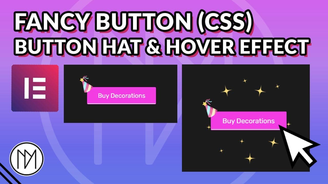
Add Decoration To Button with CSS
(Hat and Stars in this example)
Hat Settings:
In selector:after play around with top and left value to find the location of the hat.
In selector:after , change the px value for height and width to your desired size.
background-image: url(‘#ADDIMAGEURL’); : Replace #ADDIMAGEURL with the URL of the image you want to use.
rotate: -35deg; : Change the deg value to your desired rotation of the hat
Stars Settings:
In selector:hover:after, change the rotate value to your desired rotation needed for hover animation.
–dm-button-bg-height: 250px; : Change 250px to your desired height of the background image (in below example : Stars)
–dm-button-bg-width: 250px; : Change 250px to your desired width of the background image (in below example : Stars)
selector:hover:before : Change scale value to your desired size of the background image for hover animation.
					selector {

    transition: scale 0.3s;

}
selector:hover{

    scale: 1.1; /*Button Scaling On Hover*/

}

/* CSS for adding Hat*/
selector:after {

    content: '';
    position: absolute;
    top: -33px; /*Play Around with Top value for Hat location*/
    left: -29px; /*Play Around with Left value for Hat location*/
    height: 50px; /*Height of Hat*/
    width: 50px; /*Width of Hat*/

    background-image: url('#ADDIMAGEURL'); /*Add Image URL here for hat*/
    background-size:cover;
    rotate: -35deg; /*Rotating the Hat*/
    transition:rotate 0.3s;

}

selector:hover:after {

    rotate: -40deg; /*On Hover Rotate Hat*/

}

/* CSS for adding Background Stars*/
selector:before {

    --dm-button-bg-height: 250px; /*Height of Background Image*/
    --dm-button-bg-width: 250px; /*Width of Background Image*/
    content: '';
    position: absolute;
    top: calc(50% - var(--dm-button-bg-height)/2);
    left: calc(50% - var(--dm-button-bg-width)/2);
    height: var(--dm-button-bg-height);
    width: var(--dm-button-bg-width);

    background-image: url('#ADDIMAGEURL'); /*Add Image URL here for stars*/
    background-size: cover;
    background-repeat: no-repeat;
    background-position: center center;
    transition: scale 0.3s;
    scale: 0;
    z-index: -2;
    touch-action: none;
    pointer-events: none;

}

selector:hover:before {

    scale: 1; /*Scale Image BG here*/

}