(This page includes affiliate links. If you click and purchase, I receive a small commission at no extra cost from you and that way you can support me. I only recommend tools that I have personally used and loved.)
Required for Custom CSS.
1 – Elementor Pro
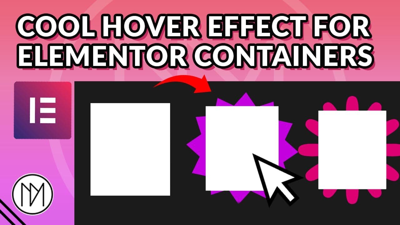
Version 1 : Constant Animated Rotation for Background Image on Hover
selector: selector is used in custom CSS panel to target the specific container
–dm-bg-image-height: 500px & –dm-bg-image-width: 500px : Change 500px to your desired size, keep both size same.
background-image: url(‘#ADDIMAGEURL’): Replace #ADDIMAGEURL with the URL of the image
transition: scale 0.5s ease: 0.5s is the duration it takes for scale animation to happen
animation: dm-rotate-bg 10s linear infinite: Change 10s (10 seconds) to how slow/fast the constant rotating animation should be.
Following steps are necessary to make it work:
1 – In the Parent Container (In below example, it is the black container), add the code selector { z-index: 1 }; , here you can add any z-index as the background image is given z-index: -1.
					selector {

     /*Add same height and width*/
    --dm-bg-image-height: 400px;
    --dm-bg-image-width: 400px;

}

/* Tablet image size */
@media (max-width: 1024px) {

    selector {
        /*Add same height and width*/
        --dm-bg-image-height: 400px;
        --dm-bg-image-width: 400px;
    }
}

/* Mobile Image size*/
@media (max-width: 767px) {
    selector {
        /*Add same height and width*/
        --dm-bg-image-height: 250px;
        --dm-bg-image-width: 250px;
    }
}


selector::after {

    content:'';
    position: absolute;
    top: calc(50% - var(--dm-bg-image-height)/2);
    left: calc(50% - var(--dm-bg-image-height)/2);
    height: var(--dm-bg-image-width);
    width: var(--dm-bg-image-width);
    background-image: url('#ADDIMAGEURL'); /*Add Image URL here*/
    background-size:100%;
    background-position: center center;
    background-repeat: no-repeat;
    transition: scale 0.5s ease; /*Duration of Scale Effect*/
    scale: 0;
    z-index: -1;
    animation: dm-rotate-bg 10s linear infinite; /*Constant Rotation Animation, change 10s to speed/slow the animation*/

}

selector:hover:after {

    scale: 1.5; /*Scale Image on Hover*/

}


@keyframes dm-rotate-bg {

    from {
        rotate:0deg;
    }
    to {

        rotate:360deg;
    }


}
Version 2: Single Rotation of Background Image on Hover
selector: selector is used in custom CSS panel to target the specific container
background-image: url(‘#ADDIMAGEURL’): Replace #ADDIMAGEURL with the url of the image
transition: scale 1s ease: change 1s to your desired value to speed or slow down the hover animation
1 – In the Parent Container (In below example, it is the black container), add the code selector { z-index: 1 }; , here you can add any z-index as the background image is given z-index: -1.
					selector {

     /*Add same height and width*/
    --dm-bg-image-height: 400px;
    --dm-bg-image-width: 400px;

}

/* Tablet image size */
@media (max-width: 1024px) {

    selector {
        /*Add same height and width*/
        --dm-bg-image-height: 400px;
        --dm-bg-image-width: 400px;
    }
}

/* Mobile Image size*/
@media (max-width: 767px) {
    selector {
        /*Add same height and width*/
        --dm-bg-image-height: 250px;
        --dm-bg-image-width: 250px;
    }
}


selector::after {

    content:'';
    position: absolute;
    top: calc(50% - var(--dm-bg-image-height)/2);
    left: calc(50% - var(--dm-bg-image-height)/2);
    height: var(--dm-bg-image-width);
    width: var(--dm-bg-image-width);
    background-image: url('#ADDIMAGEURL'); /* Add Image URL here*/
    background-size:100%;
    background-position: center center;
    background-repeat: no-repeat;
    transition: scale 1s ease,
    rotate 1s ease; /*Duration of Scale & Rotate Animation on Hover*/
    scale: 0;
    z-index: -1;

}

selector:hover:after {

    scale: 1.6; /*Scale Value on Hover*/
    rotate: 90deg; /*Rotate Value on Hover*/


}


