(This page includes affiliate links. If you click and purchase, I receive a small commission at no extra cost from you and that way you can support me. I only recommend tools that I have personally used and loved.)
Don’t want to make from scratch? Get the template instead 🙂
Introduction – Autoplay Tabs with Elementor, CSS and Javascript (JS)
In this tutorial, we will be making highly customizable animated autoscroll tabs that also has a content switcher. The code used for different versions are same, rest it dependent on your design/styling of the tabs.
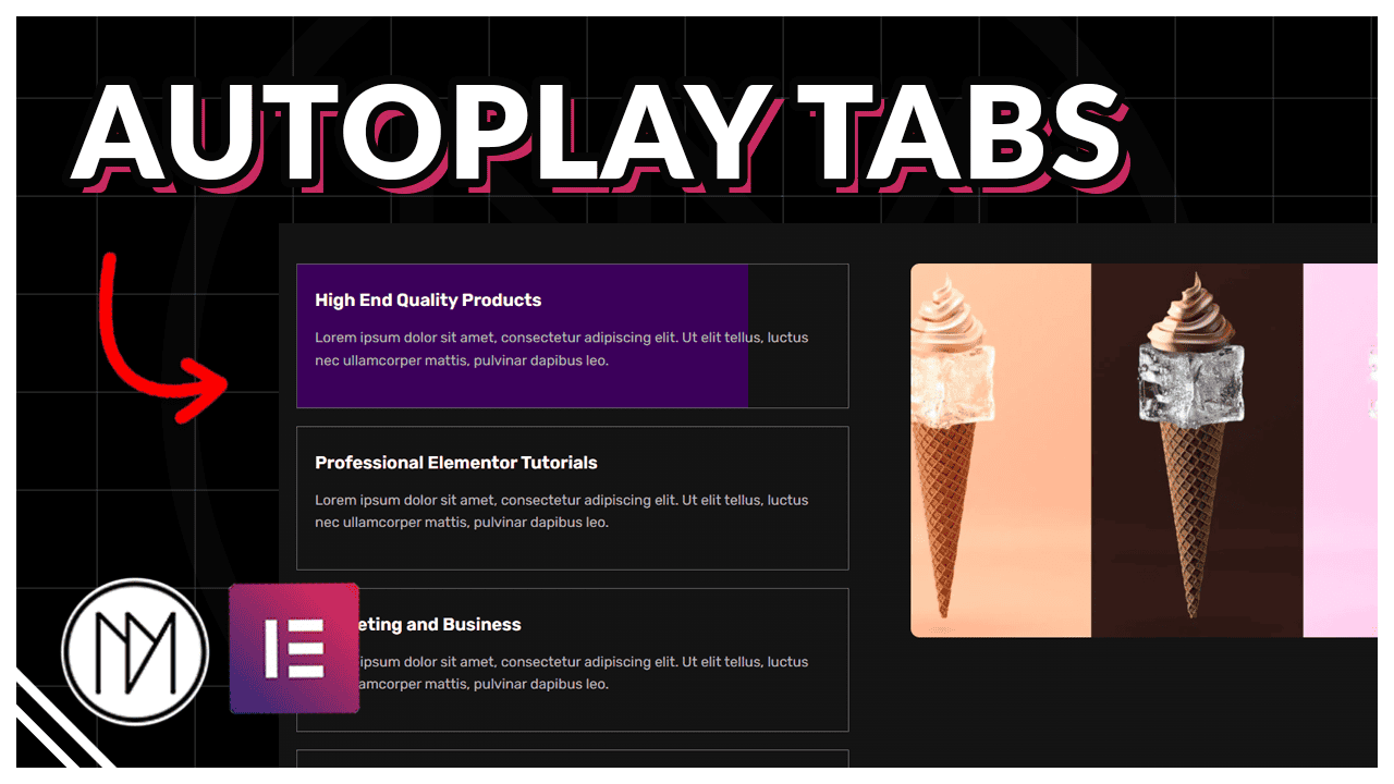
Version #1 – Autoplay Tabs with vertical progress bar
- dm-left-tab-content is the CSS of the left tabs containers. In CSS, any styling added for this class is applied to inactive tabs.
- dm-tab-active is the CSS class that gets dynamically added by javascript to the active tab. Any styling that you add in CSS gets applied to the active tab.
- dm-progress-line-bg is the CSS of the spacer widget (or div if you’re coding from scratch) that acts as progress line background color.
- dm-progress-line is the CSS class of the spacer widget (or div if you’re coding from scratch) that acts as progress line.
- dm-progress-line-active is the CSS class that gets added dynamically by javascript to the active progress line. Any styling you do for this CSS is applied to active progress line. The transition property in here for height has value of 5s, this value determines how long the progress line will take to reach the end.
- dm-right-tab-content is the CSS class given to the right images or containers that change based on active tab.
- dm-right-tab-content-active is the extra CSS class that we only give to the first image or container so that it is showing by default. This CSS class is dynamically added to the active right tab container. Any styling added in here is applied to active right tab content.
The animation property here determines the intro animations for active right tab content.
Change ‘block’ to ‘flex’ if you are using containers for right tab instead of images. (Also change ‘block’ to ‘flex’ at line 132 in javascript for containers) - At line 166, change 5000 to your desired value for autoplay timing of tabs. This value is in ms, so 5000 means 5000ms i.e 5s. Make sure to match this with transition property of dm-progress-line-active as mentioned in point (4) above.
- To target individual elements for inactive/active tabs. Simply give that element a CSS class “Example: dm-element”. Then in CSS styling type “.dm-left-tab-content .dm-element“, any styling added in this would be applied to this element for inactive state. For active state simply use “.dm-tab-active .dm-element“.
					<script src="https://cdnjs.cloudflare.com/ajax/libs/gsap/3.12.5/gsap.min.js" integrity="sha512-7eHRwcbYkK4d9g/6tD/mhkf++eoTHwpNM9woBxtPUBWm67zeAfFC+HrdoE2GanKeocly/VxeLvIqwvCdk7qScg==" crossorigin="anonymous" referrerpolicy="no-referrer"></script>

<style>

    .dm-progress-line-bg {

        height: 100%;

    }

    .dm-left-tab-content {
        transition: 0.5s opacity;
        opacity: 0.2;

    }

   /*Example CSS for individual elements*/

    /*
    .dm-left-tab-content .dm-heading h2{
        transition: 0.5s opacity;
        color:red;

    }

    .dm-tab-active .dm-heading h2{

        transition: 0.5s opacity, 0.5s color;
        color:blue !important;
        opacity: 1 !important;


    }
    */

    .dm-tab-active {
        opacity: 1;
        transition: 0.5s opacity;

    }

     .dm-progress-line {
        transition: height 0.5s;
        height: 0%;
    }

    .dm-progress-line-active {

        transition: height 5s linear;
        height: 100%;


    }

    .dm-right-tab-content {

        display: none;

    }

    .dm-right-tab-content-active {


        animation: rightTabReveal 0.5s forwards;
        display: block; /*change to flex if using container*/

    }


    @keyframes rightTabReveal {

        0% {


            opacity: 0;

        }

        100% {


            opacity: 1;


        }


    }
</style>

<script>

document.addEventListener('DOMContentLoaded', () => {

    const dmLeftTabs = document.querySelectorAll('.dm-left-tab-content');
    const dmProgressLines = document.querySelectorAll('.dm-progress-line');
    const dmRightTabs = document.querySelectorAll('.dm-right-tab-content');

    const tabAmount = dmLeftTabs.length;

    let tabIndex = -1; // default starting index
    let isTabClicked = false;

    function tabIndexManager() {
        tabIndex++;
        if (tabIndex == tabAmount) {
            tabIndex = 0;
        }
        return tabIndex;
    }

    function animateTab(currentIndex) {

        //Left Tab Animations
        dmLeftTabs.forEach((tabElement) => {
            tabElement.classList.remove('dm-tab-active');
        });

        dmLeftTabs[currentIndex].classList.add('dm-tab-active');

        //Progress Line Animations
        dmProgressLines.forEach((lineElement) => {

          lineElement.classList.remove('dm-progress-line-active');
        });

        dmProgressLines[currentIndex].classList.add('dm-progress-line-active');

        //Right Tab Animations
        dmRightTabs.forEach((rightTabElement) => {

           rightTabElement.style.display = 'none';
        });

        //change block to flex if using container
        dmRightTabs[currentIndex].style.display = 'block';
        dmRightTabs[currentIndex].classList.add('dm-right-tab-content-active');

    }

    function animateNextTab() {
        const currentIndex = tabIndexManager();
        animateTab(currentIndex);
    }

    // Add click event listeners to tabs
    dmLeftTabs.forEach((tabElement, tabElementIndex) => {
        tabElement.addEventListener('click', () => {
            isTabClicked = true;
            tabIndex = tabElementIndex; // set tabIndex to the clicked tab index
            animateTab(tabIndex); // animate from clicked tab
        });
    });

    if (!isTabClicked) {
    animateNextTab(); // Run first animation tab
    }


    // Cycle through tabs every 5 seconds (or your preferred interval)
    setInterval(() => {
        if (!isTabClicked) {
            animateNextTab(); // continue cycling
        }

        else {
                isTabClicked = false;

        }
    }, 5000); // Adjust the interval as needed

});
</script>
Version #2, #3, #4 – Autoplay Tabs with horizontal progress bar
- dm-left-tab-content-2 is the CSS of the left tabs containers. In CSS, any styling added for this class is applied to inactive tabs.
- dm-tab-active-2 is the CSS class that gets dynamically added by javascript to the active tab. Any styling that you add in CSS gets applied to the active tab.
- dm-progress-line-2 is the CSS class of the spacer widget (or div if you’re coding from scratch) that acts as progress line.
- dm-progress-line-active-2 is the CSS class that gets added dynamically by javascript to the active progress line. Any styling you do for this CSS is applied to active progress line. The transition property in here for width has value of 5s, this value determines how long the progress line will take to reach the end.
- dm-right-tab-content-2 is the CSS class given to the images or containers that change based on active tab.
- dm-right-tab-content-active-2 is the extra CSS class that we only give to the first image or container so that it is showing by default. This CSS class is dynamically added to the active right tab container. Any styling added in here is applied to active right tab content.
The animation property here determines the intro animations for active right tab content.
Change ‘block’ to ‘flex’ if you are using containers for right tab instead of images. (Also change ‘block’ to ‘flex’ at line 140 in javascript for containers) - At line 173, change 5000 to your desired value for autoplay timing of tabs. This value is in ms, so 5000 means 5000ms i.e 5s. Make sure to match this with transition property of dm-progress-line-active-2 as mentioned in point (4) above.
- To target individual elements for inactive/active tabs. Simply give that element a CSS class “Example: dm-element”. Then in CSS styling type “.dm-left-tab-content-2 .dm-element“, any styling added in this would be applied to this element for inactive state. For active state simply use “.dm-tab-active-2 .dm-element“.
- For version #3 and #4, simply add height:100%;, z-index:0; to the CSS of .dm-progress-line-2 (line 35) in code below. Also make sure to make the rest of the elements have higher z-index to place it above progress bar.
					<script src="https://cdnjs.cloudflare.com/ajax/libs/gsap/3.12.5/gsap.min.js" integrity="sha512-7eHRwcbYkK4d9g/6tD/mhkf++eoTHwpNM9woBxtPUBWm67zeAfFC+HrdoE2GanKeocly/VxeLvIqwvCdk7qScg==" crossorigin="anonymous" referrerpolicy="no-referrer"></script>

<style>

    .dm-left-tab-content-2 {
        transition: 0.5s opacity;
        opacity: 0.2;
    }

    .dm-tab-active-2 {
        opacity: 1;
        transition: 0.5s opacity;
    }

     /*Example CSS for individual elements*/

    /*
    .dm-left-tab-content-2 .dm-heading-2 h2{
        transition: 0.5s opacity;
        color:red;

    }

    .dm-tab-active-2 .dm-heading-2 h2{

        transition: 0.5s opacity, 0.5s color;
        color:blue !important;
        opacity: 1 !important;


    }
    */


     .dm-progress-line-2 {
        transition: width 0.5s;
        width: 0% !important;

        /*for version #3 and #4

        height: 100%;
        z-index:0;

        */


    }

    .dm-progress-line-active-2 {

        transition: width 5s linear;
        width: 100% !important;


    }

    .dm-right-tab-content-2 {

        display: none;

    }

    .dm-right-tab-content-active-2 {


        animation: rightTabReveal-2 0.5s forwards;
        display: block; /*change to flex if using container*/

    }


    @keyframes rightTabReveal-2 {

        0% {


            opacity: 0;

        }

        100% {


            opacity: 1;


        }


    }
</style>

<script>

document.addEventListener('DOMContentLoaded', () => {

    const dmLeftTabs2 = document.querySelectorAll('.dm-left-tab-content-2');
    const dmProgressLines2 = document.querySelectorAll('.dm-progress-line-2');
    const dmRightTabs2 = document.querySelectorAll('.dm-right-tab-content-2');

    const tabAmount2 = dmLeftTabs2.length;

    let tabIndex2 = -1; // default starting index
    let isTabClicked2 = false;

    function tabIndexManager2() {
        tabIndex2++;
        if (tabIndex2 == tabAmount2) {
            tabIndex2 = 0;
        }
        return tabIndex2;
    }

    function animateTab2(currentIndex2) {

        //Left Tab Animations
        dmLeftTabs2.forEach((tabElement) => {
            tabElement.classList.remove('dm-tab-active-2');
        });

        dmLeftTabs2[currentIndex2].classList.add('dm-tab-active-2');

        //Progress Line Animations
        dmProgressLines2.forEach((lineElement) => {

          lineElement.classList.remove('dm-progress-line-active-2');
        });

        dmProgressLines2[currentIndex2].classList.add('dm-progress-line-active-2');

        //Right Tab Animations
        dmRightTabs2.forEach((rightTabElement) => {

           rightTabElement.style.display = 'none';
        });

         //change block to flex if using container
        dmRightTabs2[currentIndex2].style.display = 'block';
        dmRightTabs2[currentIndex2].classList.add('dm-right-tab-content-active-2');

    }

    function animateNextTab2() {
        const currentIndex2 = tabIndexManager2();
        animateTab2(currentIndex2);
    }

    // Add click event listeners to tabs
    dmLeftTabs2.forEach((tabElement, tabElementIndex) => {
        tabElement.addEventListener('click', () => {
            isTabClicked2 = true;
            tabIndex2 = tabElementIndex; // set tabIndex to the clicked tab index
            animateTab2(tabIndex2); // animate from clicked tab
        });
    });

    if (!isTabClicked2) {
    animateNextTab2(); // Run first animation tab
    }

    // Cycle through tabs every 5 seconds (or your preferred interval)
    setInterval(() => {
        if (!isTabClicked2) {
            animateNextTab2(); // continue cycling
        }

        else {
                isTabClicked2 = false;

        }
    }, 5000); // Adjust the interval as needed

});
</script>
Version #5 – Autoplay Tabs with Collapsible Subcontent
- dm-left-tab-content-5 is the CSS of the left tabs containers. In CSS, any styling added for this class is applied to inactive tabs.
- dm-tab-active-5 is the CSS class that gets dynamically added by javascript to the active tab. Any styling that you add in CSS gets applied to the active tab.
- dm-progress-line-bg-5 is the CSS class of the spacer widget (or div if you’re coding from scratch) that acts as the progress line background color.
- dm-progress-line-5 is the CSS class of the spacer widget (or div if you’re coding from scratch) that acts as progress line.
- dm-progress-line-active-5 is the CSS class that gets added dynamically by javascript to the active progress line. Any styling you do for this CSS is applied to active progress line. The transition property in here for height has value of 5s, this value determines how long the progress line will take to reach the end.
- dm-right-tab-content-5 is the CSS class given to the images or containers that change based on active tab.
- dm-right-tab-content-active-5 is the extra CSS class that we only give to the first image or container so that it is showing by default. This CSS class is dynamically added to the active right tab container. Any styling added in here is applied to active right tab content.
The animation property here determines the intro animations for active right tab content.
Change ‘block’ to ‘flex’ if you are using containers for right tab instead of images. (Also change ‘block’ to ‘flex’ at line 162 in javascript for containers) - dm-left-tab-subcontent-5 is the CSS class given to the collapsible container inside our dm-left-tab-content-5 container. This container will be hidden when not active by making its height to be 0px. For the active state, the height is calculated automatically but if you wish to not calculate height dynamically and want specific value for all, then simply follow above video tutorial to see what to remove and add from code.
(Note: Do not use margins in this container as the the margin will not get calculated dynamically by code. Use spacer or padding instead. If you still wish to use margins then please watch above video to remove dynamic height calculation OFF). - At line 196, change 5000 to your desired value for autoplay timing of tabs. This value is in ms, so 5000 means 5000ms i.e 5s. Make sure to match this with transition property of dm-progress-line-active-5 as mentioned in point (5) above.
- To target individual elements for inactive/active tabs. Simply give that element a CSS class “Example: dm-element”. Then in CSS styling type “.dm-left-tab-content-5 .dm-element“, any styling added in this would be applied to this element for inactive state. For active state simply use “.dm-tab-active-5 .dm-element“.
					<script src="https://cdnjs.cloudflare.com/ajax/libs/gsap/3.12.5/gsap.min.js" integrity="sha512-7eHRwcbYkK4d9g/6tD/mhkf++eoTHwpNM9woBxtPUBWm67zeAfFC+HrdoE2GanKeocly/VxeLvIqwvCdk7qScg==" crossorigin="anonymous" referrerpolicy="no-referrer"></script>

<style>

    /*Progress line Background*/
    .dm-progress-line-bg-5 {

        height: 100%;

    }

    /*Left Tabs*/
    .dm-left-tab-content-5 {
        transition: 0.5s opacity;
        opacity: 1;

    }

    .dm-tab-active-5 {
        opacity: 1;
        transition: 0.5s opacity;
    }

    /*subcontent of left tabs*/

    .dm-left-tab-content-5 .dm-left-tab-subcontent-5 {

        height: 0px;
        overflow: hidden;
        transition: height 1s;

    }

    .dm-tab-active-5 .dm-left-tab-subcontent-5 {

        /*Height calculate via javascript*/
        height: var(--subcontentHeight5);
        overflow: hidden;
        transition: height 1s;
    }


    /*Progress Line*/
    .dm-progress-line-5 {
        transition: height 0.2s;
        height: 0%;
    }

    .dm-progress-line-active-5 {

        transition: height 5s linear;
        height: 100%;


    }

    /*Right Tabs*/

    .dm-right-tab-content-5 {

        display: none;

    }

    .dm-right-tab-content-active-5 {


        animation: rightTabReveal-5 1s forwards;
        display: block; /*change to flex if using container*/

    }


    @keyframes rightTabReveal-5 {

        0% {


            opacity: 0;

        }

        100% {


            opacity: 1;


        }


    }
</style>

<script>

document.addEventListener('DOMContentLoaded', () => {

    const dmLeftTabs5 = document.querySelectorAll('.dm-left-tab-content-5');
    const dmProgressLines5 = document.querySelectorAll('.dm-progress-line-5');
    const dmRightTabs5 = document.querySelectorAll('.dm-right-tab-content-5');

    const tabAmount5 = dmLeftTabs5.length;

    let tabIndex5 = -1; // default starting index
    let isTabClicked5 = false;

    //Increase Active Index and return that value
    function tabIndexManager5() {
        tabIndex5++;
        if (tabIndex5 == tabAmount5) {
            tabIndex5 = 0;
        }
        return tabIndex5;
    }


    //Get height of subcontent container and change it height when active/inactive

    function updateSubcontentHeight() {
        const tabSubContent5 = document.querySelector('.dm-tab-active-5 .dm-left-tab-subcontent-5');
        if (tabSubContent5) {
            // Calculate the content height
            const contentHeight5 = tabSubContent5.scrollHeight + "px";

            // Set the CSS variable
            tabSubContent5.style.setProperty('--subcontentHeight5', contentHeight5);
        }
    }


    function animateTab5(currentIndex5) {

        //Left Tab Animations
        dmLeftTabs5.forEach((tabElement5) => {
            tabElement5.classList.remove('dm-tab-active-5');
        });

        dmLeftTabs5[currentIndex5].classList.add('dm-tab-active-5');

        //Subcontent Animations

        updateSubcontentHeight();

        //Progress Line Animations
        dmProgressLines5.forEach((lineElement5) => {

          lineElement5.classList.remove('dm-progress-line-active-5');
        });

        dmProgressLines5[currentIndex5].classList.add('dm-progress-line-active-5');

        //Right Tab Animations
        dmRightTabs5.forEach((rightTabElement5) => {

           rightTabElement5.style.display = 'none';
        });

        //change block to flex if using container
        dmRightTabs5[currentIndex5].style.display = 'block';
        dmRightTabs5[currentIndex5].classList.add('dm-right-tab-content-active-5');

    }

    function animateNextTab5() {
        const currentIndex5 = tabIndexManager5();
        animateTab5(currentIndex5);
    }

    // Add click event listeners to tabs
    dmLeftTabs5.forEach((tabElement5, tabElementIndex5) => {
        tabElement5.addEventListener('click', () => {
            isTabClicked5 = true;
            tabIndex5 = tabElementIndex5; // set tabIndex to the clicked tab index
            animateTab5(tabIndex5); // animate from clicked tab
        });
    });

    if (!isTabClicked5) {
    animateNextTab5(); // Run first animation tab
    }


    // Cycle through tabs every 3 seconds (or your preferred interval)
    setInterval(() => {
        if (!isTabClicked5) {
            animateNextTab5(); // continue cycling
        }

        else {
                isTabClicked5 = false;

        }
    }, 5000); // Adjust the interval as needed

    window.addEventListener('resize', updateSubcontentHeight);

});


</script>