(This page includes affiliate links. If you click and purchase, I receive a small commission at no extra cost from you and that way you can support me. I only recommend tools that I have personally used and loved.)
Don’t want to make from scratch? Buy the template instead 🙂
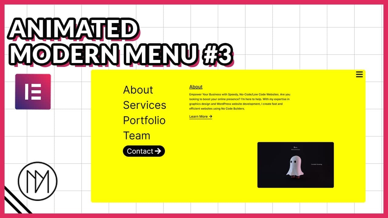
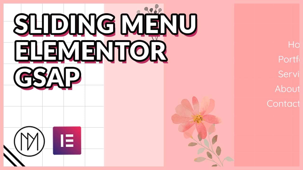
Introduction – Cascading Door Style Animated Modern Menu with Elementor & GSAP
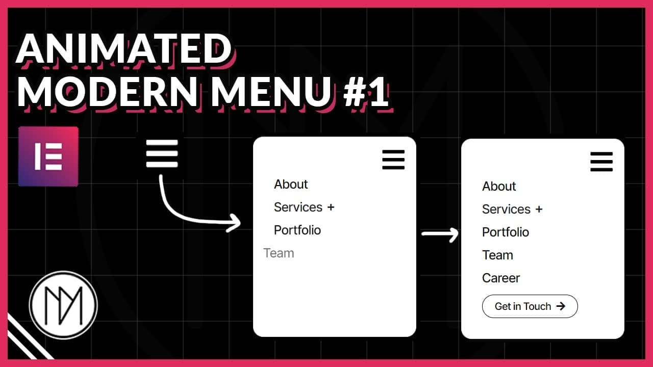
In this tutorial, we are learning to make full screen GSAP animated menu that opens/closes when clicked on our toggle button. The menu opens like a sliding door in 3 parts. You can add content in each content but recommended to only use for right most for the best design.
Animated Hamburger Icon (Toggle between Open and Close Icon)
- Refer to this video to understand it better. (https://youtu.be/FzcW342IJ-c?t=202)
- Width in .menu-icon5 changes width of the hamburger icon.
- height in .menu-icon5 changes the distance between each line.
- height in .line5 changes the thickness of the each lines.
- .menu-wrapper5 contains the styling for background, padding, border etc.
- Each CSS class has an .active state, change the appropriate values for background, border etc.
					<div class="menu-wrapper5" id="menu-wrapper5">
    <div id="menu-icon5" class="menu-icon5">
        <div class="line5 top5"></div>
        <div class="line5 middle5"></div>
        <div class="line5 bottom5"></div>
    </div>
</div>

<style>
 :root {
     --dm-normal-delay: 0.5s;
     --dm-active-delay: 0s;
     --dm-menu-transition: 0.3s;
 }

 .menu-icon5 {
    width: 30px;
    height: 25px;
    position: relative;
    cursor: pointer;
    transition: transform var(--dm-menu-transition) ease;
    transition-delay: var(--dm-normal-delay);
}

.line5 {
    width: 100%;
    height: 5px;
    background-color: black;
    position: absolute;
    transition: all var(--dm-menu-transition) ease;
    transition-delay: var(--dm-normal-delay);
}

.top5 {
    top: 0;
    transition-delay: var(--dm-normal-delay);
}

.middle5 {
    top: 50%;
    transform: translateY(-50%);
    transition-delay: var(--dm-normal-delay);
}

.bottom5 {
    bottom: 0;
    transition-delay: var(--dm-normal-delay);
}

.menu-wrapper5 {
    padding: 10px;
    /*border: 2px solid black;*/
    transition: all var(--dm-menu-transition) ease;
    /*background: white;*/
    transition-delay: var(--dm-normal-delay);
}

.menu-wrapper5.active5 .menu-icon5 {
    transform: rotate(360deg);
    transition-delay: var(--dm-active-delay);
}

.menu-wrapper5.active5 .top5 {
    transform: rotate(45deg);
    top: 50%;
    transform: translateY(-50%) rotate(45deg);
    background-color: white;
    transition-delay: var(--dm-active-delay);
}

.menu-wrapper5.active5 .middle5 {
    opacity: 0;
    transition-delay: var(--dm-active-delay);
}

.menu-wrapper5.active5 .bottom5 {
    transform: rotate(-45deg);
    bottom: 50%;
    transform: translateY(50%) rotate(-45deg);
    background-color: white;
    transition-delay: var(--dm-active-delay);
}

.menu-wrapper5.active5 {
    padding: 10px;
    /*border: 2px solid white;*/
    transition-delay: var(--dm-active-delay);
    /*background: black;*/
}

</style>

<script>
document.getElementById('menu-wrapper5').addEventListener('click', function() {
    this.classList.toggle('active5');
});
</script>
Grid Div (You can add different backgrounds too)
- grid-div is the CSS class of the HTML widget.
- You can add your custom patterns too by searching in google for “CSS background Patterns”. Example website https://www.magicpattern.design/tools/css-backgrounds.
- Here is an video explanation of creating background patterns – https://www.youtube.com/watch?v=BWoXI5gDsrs
					<style>

    .grid-div {

        position: absolute;
        left: 0;
        top:0;
        height: 100%;
        width: 100%;
        pointer-events: none;
        background-size: 100px 100px;
        background-position: center center;
        /* Grid size */
        background-image:
            linear-gradient(to right, rgba(255,255,255, 0.1) 1px, transparent 1px),
            linear-gradient(to bottom, rgba(255,255,255,0.1) 1px, transparent 1px);
    }

</style>

<script>

    const dmGrid = document.querySelector('.grid-div');

document.addEventListener('mousemove', (e) => {
    const mouseX = e.pageX;
    const mouseY = e.pageY;

    // Calculate the grid position shift
    const shiftX = (mouseX / window.innerWidth) * 50 - 25;
    const shiftY = (mouseY / window.innerHeight) * 50 - 25;

    // Apply the shift to the background position
    dmGrid.style.backgroundPosition = `${-shiftX}px ${-shiftY}px`;
});


</script>
Sliding Door Style Menu Code – CSS and Javascript (JS)
- dm-menu-off-slide-wrapper is the CSS of the parent container of all contents of menu.
- dm-menu-off-slide-toggle is the CSS class of the menu icon.
- dm-menu-off-slide-column-1, .dm-menu-off-slide-column-2, .dm-menu-off-slide-column-3 are the CSS class of each “door” container from left to right respectively.
- dm-menu-off-slide-page-wrapper is the CSS class of container that contains how heading and divider.
- dm-menu-off-slide-page is the CSS class of Heading widget that we use for our menu.
- dm-menu-off-slide-divider is the CSS class of the divider that is besides our menu titles.
					<script src="https://cdnjs.cloudflare.com/ajax/libs/gsap/3.12.5/gsap.min.js" integrity="sha512-7eHRwcbYkK4d9g/6tD/mhkf++eoTHwpNM9woBxtPUBWm67zeAfFC+HrdoE2GanKeocly/VxeLvIqwvCdk7qScg==" crossorigin="anonymous" referrerpolicy="no-referrer"></script>

<style>

    .dm-menu-off-slide-wrapper, .dm-menu-off-slide-column-1, .dm-menu-off-slide-column-2, .dm-menu-off-slide-column-3

    {

        transition: none !important;
    }

    .dm-menu-off-slide-wrapper {

        pointer-events: none;
        max-height: 100vh;
        overflow-y:scroll;

    }


     .dm-menu-off-slide-column-1, .dm-menu-off-slide-column-2 {

         opacity: 1;
     }

     .dm-menu-off-slide-divider {

         transition: 0.3s;
     }

    .dm-menu-off-slide-page-wrapper:hover .dm-menu-off-slide-divider {

        width: 20%;


    }

      /*Hides scrollbar in webkit browsers like chrome etc*/
    .dm-menu-off-slide-wrapper::-webkit-scrollbar {

        width: 0px;
    }

    /*Hide scrollbar for firefox*/

        .dm-menu-off-slide-wrapper {

         scrollbar-width: none;

    }


</style>

<script>

    const dmMenuOffSlideToggle = document.querySelector('.dm-menu-off-slide-toggle');
    const dmMenuOffSlideWrapper = document.querySelector('.dm-menu-off-slide-wrapper');

    const dmSlideColumn1 = document.querySelector('.dm-menu-off-slide-column-1');
     const dmSlideColumn2 = document.querySelector('.dm-menu-off-slide-column-2');
      const dmSlideColumn3 = document.querySelector('.dm-menu-off-slide-column-3');

    let dmMenuOffSlideActive = false;


    dmSlideColumn1.style.opacity = '0';
     dmSlideColumn2.style.opacity = '0';
      dmSlideColumn3.style.opacity = '0';


     const dmSlideTimeline = gsap.timeline();

    dmSlideTimeline.pause();

    dmMenuOffSlideToggle.addEventListener('click', ()=> {

        if(dmMenuOffSlideActive) {

             dmSlideTimeline.reverse();
            dmMenuOffSlideWrapper.style.pointerEvents = 'none';
            //  body.classList.remove('no-scroll');

        }

        else {

            dmMenuOffSlideWrapper.style.pointerEvents = 'auto';
            dmSlideTimeline.play();
            //  body.classList.add('no-scroll');

        }

       dmMenuOffSlideActive = !dmMenuOffSlideActive;

    });


    dmSlideTimeline.from(dmSlideColumn3, {

        onStart: () => {

        dmSlideColumn3.style.opacity = '1';
        },

       x:'150%',
       duration:0.5,

       onReverseComplete: () => {

        dmSlideColumn3.style.opacity = '0';


       }

    });


    dmSlideTimeline.from(dmSlideColumn2, {

          onStart: () => {

        dmSlideColumn2.style.opacity = '1';
        },

       x:'200%',
       duration:0.5,

       onReverseComplete: () => {

        dmSlideColumn2.style.opacity = '0';


       }

    }, '-=0.3');


    dmSlideTimeline.from(dmSlideColumn1, {

          onStart: () => {

        dmSlideColumn1.style.opacity = '1';
        },

       x:'300%',
       duration:0.5,

       onReverseComplete: () => {

        dmSlideColumn1.style.opacity = '0';


       }


    }, '-=0.4');


</script>
					/*No Scroll Code, Only to be used for Static Header*/

<style>

     /*Stop scrolling when Full screen Menu is opened*/
    body.no-scroll {
            overflow: hidden !important;
            max-height: 100vh !important;
        }

</style>

<script>

    const body = document.body;

</script>