(This page includes affiliate links. If you click and purchase, I receive a small commission at no extra cost from you and that way you can support me. I only recommend tools that I have personally used and loved.)
Don’t want to make from scratch? Buy the template instead 🙂

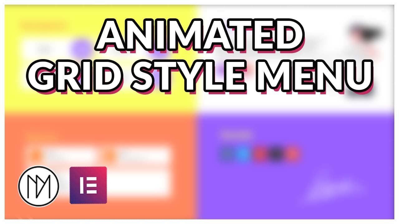
Introduction – Grid Style Animated Modern Menu with Elementor & GSAP
In this tutorial, we are learning to make full screen GSAP animated menu that opens/closes when clicked on our toggle button. This menu is very customizable and allows to show more content in organized manner than any normal menu.
Animated Hamburger Icon (Toggle between Open and Close Icon)
- Refer to this video to understand it better. (https://youtu.be/FzcW342IJ-c?t=202)
- Width in .menu-icon-4 changes width of the hamburger icon.
- height in .menu-icon-4 changes the distance between each line.
- height in .line-4 changes the thickness of the each lines.
- .menu-wrapper-4 contains the styling for background, padding, border etc.
- Each CSS class has an .active state, change the appropriate values for background, border etc.
					<div class="menu-wrapper-4" id="menu-wrapper-4">
    <div id="menu-icon-4" class="menu-icon-4">
        <div class="line-4 top-4"></div>
        <div class="line-4 middle-4"></div>
        <div class="line-4 bottom-4"></div>
    </div>
</div>
<style>
 :root {
     --dm-normal-delay: 1s;
     --dm-active-delay: 0s;
     --dm-menu-transition: 0.3s;
 }

 .menu-icon-4 {
    width: 30px;
    height: 25px;
    position: relative;
    cursor: pointer;
    transition: transform var(--dm-menu-transition) ease;
    transition-delay: var(--dm-normal-delay);
}

.line-4 {
    width: 100%;
    height: 5px;
    background-color: black;
    position: absolute;
    transition: all var(--dm-menu-transition) ease;
    transition-delay: var(--dm-normal-delay);
}

.top-4 {
    top: 0;
    transition-delay: var(--dm-normal-delay);
}

.middle-4 {
    top: 50%;
    transform: translateY(-50%);
    transition-delay: var(--dm-normal-delay);
}

.bottom-4 {
    bottom: 0;
    transition-delay: var(--dm-normal-delay);
}

.menu-wrapper-4 {
    padding: 10px;
    border: 2px solid black;
    transition: all var(--dm-menu-transition) ease;
    background: white;
    transition-delay: var(--dm-normal-delay);
}

.menu-wrapper-4.active .menu-icon-4 {
    transform: rotate(360deg);
    transition-delay: var(--dm-active-delay);
}

.menu-wrapper-4.active .top-4 {
    transform: rotate(45deg);
    top: 50%;
    transform: translateY(-50%) rotate(45deg);
    background-color: white;
    transition-delay: var(--dm-active-delay);
}

.menu-wrapper-4.active .middle-4 {
    opacity: 0;
    transition-delay: var(--dm-active-delay);
}

.menu-wrapper-4.active .bottom-4 {
    transform: rotate(-45deg);
    bottom: 50%;
    transform: translateY(50%) rotate(-45deg);
    background-color: white;
    transition-delay: var(--dm-active-delay);
}

.menu-wrapper-4.active {
    padding: 10px;
    border: 2px solid white;
    transition-delay: var(--dm-active-delay);
    background: black;
}
</style>

<script>
document.getElementById('menu-wrapper-4').addEventListener('click', function() {
    this.classList.toggle('active');
});
</script>
Grid Style Menu Code – CSS and Javascript (JS)
- dm-menu-grid-wrapper is the CSS of the parent container of all contents of menu.
- dm-menu-grid-toggle is the CSS class of the menu icon.
- dm-menu-top-left, .dm-menu-top-right, .dm-menu-bottom-left, .dm-menu-bottom-right are the CSS classes of the respective containers inside of dm-menu-grid-wrapper.
					<script src="https://cdnjs.cloudflare.com/ajax/libs/gsap/3.12.5/gsap.min.js" integrity="sha512-7eHRwcbYkK4d9g/6tD/mhkf++eoTHwpNM9woBxtPUBWm67zeAfFC+HrdoE2GanKeocly/VxeLvIqwvCdk7qScg==" crossorigin="anonymous" referrerpolicy="no-referrer"></script>

<style>

    .dm-menu-top-left, .dm-menu-top-right, .dm-menu-bottom-left, .dm-menu-bottom-right {


        transition: none !important;

    }

    .dm-menu-grid-wrapper {

        pointer-events: none;
        backdrop-filter: blur(0px);
    transition: backdrop-filter 1s;
        height: 100vh;
        overflow-y:scroll;
    }

    .frosted-glass-blur {

    -webkit-backdrop-filter: blur(10px);
    backdrop-filter: blur(10px);
    transition: 0.3s;

}

    /*Scroll for tablet/mobile devices*/

    .dm-menu-grid-wrapper {

        overflow-y:scroll;
        max-height: 100vh;
    }

    /*Hides scrollbar in webkit browsers like chrome etc*/
    .dm-menu-grid-wrapper::-webkit-scrollbar {

        width: 0px;
    }

    /*Hide scrollbar for firefox*/

    .dm-menu-grid-wrapper {

         scrollbar-width: none;

    }


</style>

<script>

    const dmMenuGridTimeline = gsap.timeline();
    const dmMenuGridToggle = document.querySelector('.dm-menu-grid-toggle');
    const dmMenuGridWrapper = document.querySelector('.dm-menu-grid-wrapper');

    dmMenuGridTimeline.pause();

    let dmMenuGridTimelinePlayed = false;

    dmMenuGridToggle.addEventListener('click', () => {

       if(dmMenuGridTimelinePlayed) {

         dmMenuGridTimeline.reverse();
         dmMenuGridWrapper.style.pointerEvents =   'none';
         dmMenuGridWrapper.classList.remove('frosted-glass-blur');
          //  body.classList.remove('no-scroll');

       }

       else {

           dmMenuGridTimeline.play();
           dmMenuGridWrapper.style.pointerEvents =   'auto';
            dmMenuGridWrapper.classList.add('frosted-glass-blur');
            //  body.classList.add('no-scroll');

       }

       dmMenuGridTimelinePlayed = !dmMenuGridTimelinePlayed;

    });

    dmNavResponsiveGrid = gsap.matchMedia();

dmNavResponsiveGrid.add('(min-width:768px)', () => {

dmMenuGridTimeline.from('.dm-menu-top-left', {

       x:'-100%',
       duration:0.5,
       ease: "power1.out"

    },0);


    dmMenuGridTimeline.from('.dm-menu-bottom-left', {

       y:'100%',
       duration:0.5,
       ease: "power1.out"

    }, 0.2);


    dmMenuGridTimeline.from('.dm-menu-bottom-right', {

       x:'100%',
       duration:0.5,
       ease: "power1.out"

    }, 0.5);

    dmMenuGridTimeline.from('.dm-menu-top-right', {

       y:'-100%',
       duration:0.5,
       ease: "power1.out"

    }, 0.7);

});


dmNavResponsiveGrid.add('(max-width:767px)', () => {


dmMenuGridTimeline.from('.dm-menu-top-left', {

       x:'100%',
       duration:0.5,
       ease: "power1.out"

    },0);


    dmMenuGridTimeline.from('.dm-menu-bottom-left', {

       x:'100%',
       duration:0.5,
       ease: "power1.out"

    }, 0.2);


    dmMenuGridTimeline.from('.dm-menu-bottom-right', {

       x:'100%',
       duration:0.5,
       ease: "power1.out"

    }, 0.5);

    dmMenuGridTimeline.from('.dm-menu-top-right', {

       x:'100%',
       duration:0.5,
       ease: "power1.out"

    }, 0.7);

});


</script>
					/*No Scroll Code, Only to be used for Static Header*/

<style>

     /*Stop scrolling when Full screen Menu is opened*/
    body.no-scroll {
            overflow: hidden !important;
            max-height: 100vh !important;
        }

</style>

<script>

    const body = document.body;

</script>