
(This page includes affiliate links. If you click and purchase, I receive a small commission at no extra cost from you and that way you can support me. I only recommend tools that I have personally used and loved.)
Don’t want to make from scratch? Get the template instead 🙂

Introduction – Making a Custom Coverflow Slider Carousel with Elementor and SwiperJS
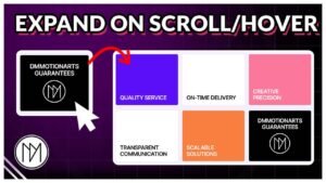
In this tutorial, we will create an amazing effect provided by swiperjs called coverflow. This effect is highly customizable and provides different layouts. To learn all layouts and customization, please refer the video tutorial.
Layout for containers or DIV:

The main layout is having a swiper container, inside it should be swiper-wrapper and inside swiper-wrapper should be slides. The swiper navigation container is optional, you can directly add Arrow icons and swiper-pagination in swiper container directly.
Support by
using these links
(Affiliate)
Start Earning by becoming an Elementor Affiliate
Prev
Next
Coverflow Slider Code
- .dm-coverflow-swiper is the CSS class for the main container that has all the slides, navigation, and pagination.
- direction allows you to choose between horizontal and vertical direction for your slider.
- loop can be set to true/false to enable or disable looping.
- To add more features, refer to the “Custom Carousel” blog post or its video to learn how to customize further. Link – https://dmmotionarts.com/custom-base-slider-with-autoplay-elementor-swiperjs-slider-tutorial/
- wrapperClass is used to use custom CSS class for our swiper-wrapper. This is important as we don’t want elementor swiper styling to be applied here.
- slideClass is used to use custom CSS class for our slides. Important for the same reason as above.
- nextEl and prevEl is the CSS class that we use for navigation buttons. It can be added to any icon, image or text.
- In pagination, el: allows us to specify which container/div is our pagination container.
- We have different pagination types available. You can read or watch video on “Custom Carousel Blog Post” page.
- Coverflow effect customization:
– rotate defines how much each slide should be rotated. You can make this 0 for a new effect.
– depth defines how far slides are from you in 3D space.
– modifier controls intensity by multiply the effect more. 1 means no effect, 2 will make all effects twice as powerful. (Example: rotate 50 will act as rotate 100)
– slideShadows can be turned true/false, it simply controls the shadow casted on slides by other slides.
					<link rel="stylesheet" href="https://cdnjs.cloudflare.com/ajax/libs/Swiper/11.0.5/swiper-bundle.css" integrity="sha512-pmAAV1X4Nh5jA9m+jcvwJXFQvCBi3T17aZ1KWkqXr7g/O2YMvO8rfaa5ETWDuBvRq6fbDjlw4jHL44jNTScaKg==" crossorigin="anonymous" referrerpolicy="no-referrer" />

<script src="https://cdnjs.cloudflare.com/ajax/libs/Swiper/11.0.5/swiper-bundle.min.js" integrity="sha512-Ysw1DcK1P+uYLqprEAzNQJP+J4hTx4t/3X2nbVwszao8wD+9afLjBQYjz7Uk4ADP+Er++mJoScI42ueGtQOzEA==" crossorigin="anonymous" referrerpolicy="no-referrer"></script>

<script>

window.addEventListener("load", (event) => {

    const swiper = new Swiper('.dm-coverflow-swiper', {
      // Optional parameters
      direction: 'horizontal',
      loop: true,
      grabCursor: true,
      centeredSlides: true,
      effect: "coverflow",
      coverflowEffect: {
        rotate: 50,
        stretch: 0,
        depth: 100,
        modifier: 1,
        slideShadows: true,
      },


      // Wrapper and slide class
      wrapperClass: 'dm-coverflow-swiper-wrapper',
      slideClass: 'dm-coverflow-swiper-slide',


    navigation: {
    nextEl: ".dm-coverflow-swiper-next",
    prevEl: ".dm-coverflow-swiper-prev",
  },
  pagination: {
    el: ".dm-coverflow-swiper-pagination",
    type: "fraction",
  },

   breakpoints: {

       1024: {

           spaceBetween: 0,
           slidesPerView: 3,
       },

        767: {

          spaceBetween: 0,
          slidesPerView: 3,
        },

        0: {

          spaceBetween: 0,
          slidesPerView: 1,

        },
      },

    });

 });


</script>

<style>

    .dm-coverflow-swiper-wrapper .e-con.e-flex{

        flex-shrink: 0 !important;
    }

    .dm-coverflow-swiper-pagination {

        max-width:10% !important;
    }

    .dm-coverflow-swiper,
    .dm-coverflow-swiper-wrapper

    {

        transform-style: preserve-3d;

    }

    .dm-coverflow-swiper {

        overflow-x:clip;
    }


</style>