
(This page includes affiliate links. If you click and purchase, I receive a small commission at no extra cost from you and that way you can support me. I only recommend tools that I have personally used and loved.)
Get Elementor Pro Today –
1 – Elementor Pro
Don’t want to make from scratch? Buy the template instead 🙂
Introduction – Animated Modern Menus with Elementor & GSAP
In this tutorial, we are learning to make animated menus with GSAP and Elementor. Keep in mind that not all menus will work perfectly in mobile, so create a different version for mobile version. You will need watch the video above to understand where to add the code due to its complexity. Alternatively, you can purchase the Modern Menu pack to quickly jumpstart your menus.
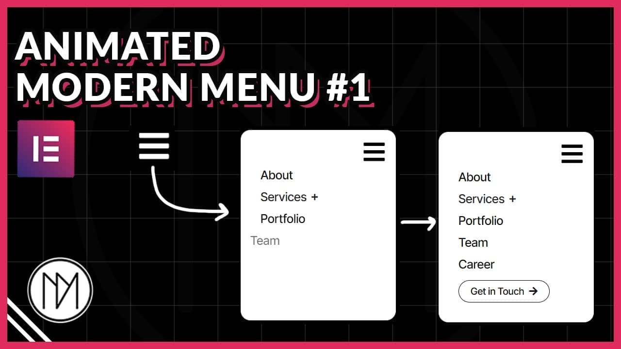
Animated Modern Menu #1 (Left Reveal Menu)
- dm-menu-list-1 is the CSS class of the menu items. These can be page links, images or any widget you wish to add in the menu.
- dm-menu-container-1 is the CSS class of the container that contains all the menu items.
- dm-menu-icon-1 is the CSS class of the icon that opens/closes the menu. You can add a button, text or any widget and give it the class dm-menu-icon-1 and it will open/close the menu container.
- Change the color and fill code to choose which colors shows when menu is opened and closed.
					<script src="https://cdnjs.cloudflare.com/ajax/libs/gsap/3.12.5/gsap.min.js"></script>

<style>

    .dm-menu-list-1 {

        transition: none !important;
    }

    .dm-menu-container-1 {

        transition: none !important;
    }

    .dm-menu-icon-1 .elementor-icon{

        color:white; /*Incase color doesn't change, use fill*/
        fill:white;
        transition-delay: 1s !important;
        transition: 0.3s;
    }

    .dm-menu-icon-1.active .elementor-icon{

        transition-delay: 0.2s !important;
        color:black;/*Incase color doesn't change, use fill*/
        fill:black;

    }

</style>

<script>

    const dmMenu1 = gsap.timeline();

    dmMenu1.pause();

    dmMenu1.from('.dm-menu-container-1', {

        scale:0,
        opacity:0,
        transformOrigin:'top right',
        duration:0.5,
        ease:'power3.inOut'

    });

    dmMenu1.from('.dm-menu-list-1', {

       x:-50,
       opacity:0,
       transformOrigin: 'bottom left',
       duration: 0.25,
       stagger: 0.1,
       ease: 'power3.inOut'

    });

    const dmMenuIcon1 = document.querySelector('.dm-menu-icon-1');
    let dmMenu1Open = false;

    dmMenuIcon1.addEventListener('click', () => {

        if(dmMenu1Open == false) {
            dmMenu1.timeScale(1).play();
            dmMenuIcon1.classList.add('active');
        }
        else {
            dmMenu1.timeScale(1).reverse();
            dmMenuIcon1.classList.remove('active');
        }

        dmMenu1Open = !dmMenu1Open;

    });

</script>
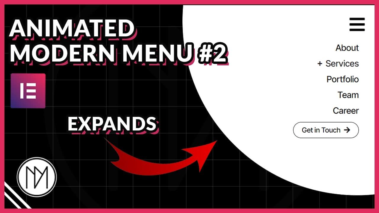
Animated Modern Menu #1a (Bottom Reveal Menu)
- dm-menu-list-1a is the CSS class of menu items. Besides page links, you can also add any other widget and give it this class for the animation to work.
- dm-menu-container-1a is the CSS class of the container that contains the menu lists.
- dm-menu-icon-1a is the CSS class of the icon that opens/closes menu. Besides a icon, you can use any other widget like image, lottie etc. to open/close menu.
- Change the color & fill value to your desired color/hex code to choose the menu icon color when it closes/opens.
					<script src="https://cdnjs.cloudflare.com/ajax/libs/gsap/3.12.5/gsap.min.js"></script>

<style>
    .dm-menu-list-1a {
        transition: none !important;
    }

    .dm-menu-container-1a {
        transition: none !important;
    }

    .dm-menu-icon-1a .elementor-icon{

        color:white;
        fill:white;
        transition-delay: 1s !important;
        transition: 0.3s;
    }

    .dm-menu-icon-1a.active .elementor-icon{

        transition-delay: 0.2s !important;
        color:black;
        fill:black;

    }
</style>

<script>
    const dmMenu1a = gsap.timeline();

    dmMenu1a.pause();

    dmMenu1a.from('.dm-menu-container-1a', {
        scale: 0,
        opacity: 0,
        transformOrigin: 'top right',
        duration: 0.5,
        ease: 'power3.inOut'
    });

    dmMenu1a.from('.dm-menu-list-1a', {
       y: 20,
       opacity: 0,
       transformOrigin: 'bottom left',
       duration: 0.25,
       stagger: 0.1,
       ease: 'power3.inOut'
    });

    const dmMenuIcon1a = document.querySelector('.dm-menu-icon-1a');
    let dmMenu1aOpen = false;

    dmMenuIcon1a.addEventListener('click', () => {
        if (dmMenu1aOpen == false) {
            dmMenu1a.timeScale(1).play();
            dmMenuIcon1a.classList.add('active');
        } else {
            dmMenu1a.timeScale(1).reverse();
            dmMenuIcon1a.classList.remove('active');
        }
        dmMenu1aOpen = !dmMenu1aOpen;
    });
</script>
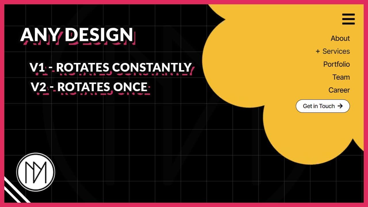
Animated Modern Menu #1b (Scale Up Reveal)
- dm-menu-list-1b is the CSS class of menu items. Besides page links, you can also add any other widget and give it this class for the animation to work.
- dm-menu-container-1b is the CSS class of the container that contains the menu lists.
- dm-menu-icon-1b is the CSS class of the icon that opens/closes menu. Besides a icon, you can use any other widget like image, lottie etc. to open/close menu.
- Change the color & fill value to your desired color/hex code to choose the menu icon color when it closes/opens.
					<script src="https://cdnjs.cloudflare.com/ajax/libs/gsap/3.12.5/gsap.min.js"></script>

<style>
    .dm-menu-list-1b {
        transition: none !important;
    }

    .dm-menu-container-1b {
        transition: none !important;
    }


    .dm-menu-icon-1b .elementor-icon{

        color:white;
        fill:white;
        transition-delay: 1s !important;
        transition: 0.3s;
    }

    .dm-menu-icon-1b.active .elementor-icon{

        transition-delay: 0.2s !important;
        color:black;
        fill:black;
    }
</style>

<script>
    const dmMenu1b = gsap.timeline();

    dmMenu1b.pause();

    dmMenu1b.from('.dm-menu-container-1b', {
        scale: 0,
        opacity: 0,
        transformOrigin: 'top right',
        duration: 0.5,
        ease: 'power3.inOut'
    });

    dmMenu1b.from('.dm-menu-list-1b', {
       scale:0,
       opacity: 0,
       transformOrigin: 'bottom left',
       duration: 0.25,
       stagger: 0.1,
       ease: 'power3.inOut'
    });

    const dmMenuIcon1b = document.querySelector('.dm-menu-icon-1b');
    let dmMenu1bOpen = false;

    dmMenuIcon1b.addEventListener('click', () => {
        if (dmMenu1bOpen == false) {
            dmMenu1b.timeScale(1).play();
            dmMenuIcon1b.classList.add('active');
        } else {
            dmMenu1b.timeScale(1).reverse();
            dmMenuIcon1b.classList.remove('active');
        }
        dmMenu1bOpen = !dmMenu1bOpen;
    });
</script>
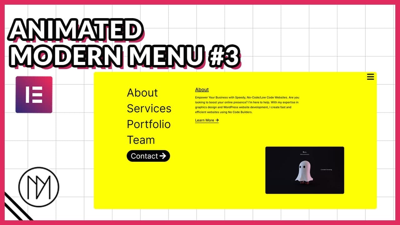
Animated Modern Menu #1c (RotateX Reveal)
- dm-menu-list-1c is the CSS class of menu items. Besides page links, you can also add any other widget and give it this class for the animation to work.
- dm-menu-container-1c is the CSS class of the container that contains the menu lists.
- dm-menu-icon-1c is the CSS class of the icon that opens/closes menu. Besides a icon, you can use any other widget like image, lottie etc. to open/close menu.
- Change the color & fill value to your desired color/hex code to choose the menu icon color when it closes/opens.
					<script src="https://cdnjs.cloudflare.com/ajax/libs/gsap/3.12.5/gsap.min.js"></script>

<style>
    .dm-menu-list-1c {
        transition: none !important;
    }

    .dm-menu-container-1c {
        transition: none !important;
    }


    .dm-menu-icon-1c .elementor-icon{

        color:white;
        fill:white;
        transition-delay: 1s !important;
        transition: 0.3s;
    }

    .dm-menu-icon-1c.active .elementor-icon{

        transition-delay: 0.2s !important;
        color:black;
        fill:black;

    }
</style>

<script>
    const dmMenu1c = gsap.timeline();

    dmMenu1c.pause();

    dmMenu1c.from('.dm-menu-container-1c', {
        scale: 0,
        opacity: 0,
        transformOrigin: 'top right',
        duration: 0.5,
        ease: 'power3.inOut'
    });

    dmMenu1c.from('.dm-menu-list-1c', {

       rotateX:'90deg',
       transformOrigin: 'bottom left',
       duration: 0.25,
       stagger: 0.1,
       ease: 'power3.inOut'
    });

    const dmMenuIcon1c = document.querySelector('.dm-menu-icon-1c');
    let dmMenu1cOpen = false;

    dmMenuIcon1c.addEventListener('click', () => {
        if (dmMenu1cOpen == false) {
            dmMenu1c.timeScale(1).play();
            dmMenuIcon1c.classList.add('active');
        } else {
            dmMenu1c.timeScale(1).reverse();
            dmMenuIcon1c.classList.remove('active');
        }
        dmMenu1cOpen = !dmMenu1cOpen;
    });
</script>