(This page includes affiliate links. If you click and purchase, I receive a small commission at no extra cost from you and that way you can support me. I only recommend tools that I have personally used and loved.)
Don’t want to make from scratch? Get the template instead 🙂

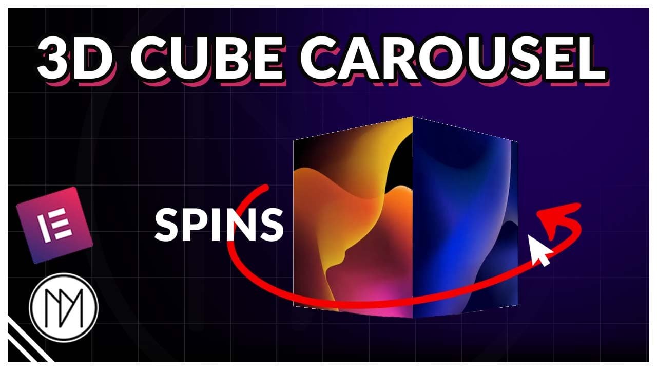
Introduction – Making a Custom Cube Slider Carousel with Elementor and SwiperJS
In this tutorial, we will learn to create a 3D cube effect carousel. It can be made in two ways – horizontal slider or vertical slider. Also a free elementor template is provided above.
Layout for containers or DIV:

The main layout is having a swiper container, inside it should be swiper-wrapper and inside swiper-wrapper should be slides. The swiper navigation container is optional, you can directly add Arrow icons and swiper-pagination in swiper container directly.
Support by
using these links
(Affiliate)
Start Earning by becoming an Elementor Affiliate
Version 1 – Horizontal Cube Slider Code
- .dm-cube-swiper is the CSS class for the main container that has all the slides, navigation, and pagination.
- direction allows you to choose between horizontal and vertical direction for your slider.
- loop can be set to true/false to enable or disable looping.
- To add more features, refer to the “Custom Carousel” blog post or its video to learn how to customize further. Link – https://dmmotionarts.com/custom-base-slider-with-autoplay-elementor-swiperjs-slider-tutorial/
- wrapperClass is used to use custom CSS class for our swiper-wrapper. This is important as we don’t want elementor swiper styling to be applied here.
- slideClass is used to use custom CSS class for our slides. Important for the same reason as above.
- nextEl and prevEl is the CSS class that we use for navigation buttons. It can be added to any icon, image or text.
- In pagination, el: allows us to specify which container/div is our pagination container.
- We have different pagination types available. You can read or watch video on “Custom Carousel Blog Post” page.
					<link rel="stylesheet" href="https://cdnjs.cloudflare.com/ajax/libs/Swiper/11.0.5/swiper-bundle.css" integrity="sha512-pmAAV1X4Nh5jA9m+jcvwJXFQvCBi3T17aZ1KWkqXr7g/O2YMvO8rfaa5ETWDuBvRq6fbDjlw4jHL44jNTScaKg==" crossorigin="anonymous" referrerpolicy="no-referrer" />

<script src="https://cdnjs.cloudflare.com/ajax/libs/Swiper/11.0.5/swiper-bundle.min.js" integrity="sha512-Ysw1DcK1P+uYLqprEAzNQJP+J4hTx4t/3X2nbVwszao8wD+9afLjBQYjz7Uk4ADP+Er++mJoScI42ueGtQOzEA==" crossorigin="anonymous" referrerpolicy="no-referrer"></script>

<script>

window.addEventListener("load", (event) => {

    const swiper = new Swiper('.dm-cube-swiper', {
      // Optional parameters
      direction: 'horizontal',
      loop: true,
      grabCursor: true,
      spaceBetween: 0,
      effect: "cube",
      cubeEffect: {
        shadow: true,
        slideShadows: true,
        shadowOffset: 20,
        shadowScale: 0.94,
      },

      // Wrapper and slide class
      wrapperClass: 'dm-cube-swiper-wrapper',
      slideClass: 'dm-cube-swiper-slide',

    navigation: {
    nextEl: ".dm-cube-swiper-next",
    prevEl: ".dm-cube-swiper-prev",
  },
  pagination: {
    el: ".dm-cube-swiper-pagination",
    type: "fraction",
  }

    });

 });


</script>

<style>

    .dm-cube-swiper-wrapper .e-con.e-flex{

        flex-shrink: 0 !important;
    }

    .dm-cube-swiper-pagination {

        max-width:fit-content !important;
    }

    .dm-cube-swiper-wrapper

    {

        transform-style: preserve-3d;
        z-index: 2;

    }

    .dm-cube-swiper-slide {

        transform-origin: left center !important;
        pointer-events: none;

    }

    .dm-cube-swiper-slide.swiper-slide-active {

        pointer-events: auto ;
    }

</style>
Version 2 – Vertical Cube Slider Code
- .dm-cube-v-swiper is the CSS class for the main container that has all the slides, navigation, and pagination.
- height is set via code as Elementor CSS keeps conflicting. So replace your desired height for all devices in the code marked.
- direction allows you to choose between horizontal and vertical direction for your slider.
- loop can be set to true/false to enable or disable looping.
- To add more features, refer to the “Custom Carousel” blog post or its video to learn how to customize further. Link – https://dmmotionarts.com/custom-carousel-with-swiper-js-and-elementor/
- wrapperClass is used to use custom CSS class for our swiper-wrapper. This is important as we don’t want elementor swiper styling to be applied here.
- slideClass is used to use custom CSS class for our slides. Important for the same reason as above.
- nextEl and prevEl is the CSS class that we use for navigation buttons. It can be added to any icon, image or text.
- In pagination, el: allows us to specify which container/div is our pagination container.
- We have different pagination types available. You can read or watch video on “Custom Carousel Blog Post” page.
					<link rel="stylesheet" href="https://cdnjs.cloudflare.com/ajax/libs/Swiper/11.0.5/swiper-bundle.css" integrity="sha512-pmAAV1X4Nh5jA9m+jcvwJXFQvCBi3T17aZ1KWkqXr7g/O2YMvO8rfaa5ETWDuBvRq6fbDjlw4jHL44jNTScaKg==" crossorigin="anonymous" referrerpolicy="no-referrer" />

<script src="https://cdnjs.cloudflare.com/ajax/libs/Swiper/11.0.5/swiper-bundle.min.js" integrity="sha512-Ysw1DcK1P+uYLqprEAzNQJP+J4hTx4t/3X2nbVwszao8wD+9afLjBQYjz7Uk4ADP+Er++mJoScI42ueGtQOzEA==" crossorigin="anonymous" referrerpolicy="no-referrer"></script>

<script>

window.addEventListener("load", (event) => {

    const swiper = new Swiper('.dm-cube-v-swiper', {
      // Optional parameters
      direction: 'vertical',
      loop: true,
      grabCursor: true,
      spaceBetween: 0,
      effect: "cube",
      cubeEffect: {
        shadow: true,
        slideShadows: true,
        shadowOffset: 20,
        shadowScale: 0.94,
      },

      // Wrapper and slide class
      wrapperClass: 'dm-cube-v-swiper-wrapper',
      slideClass: 'dm-cube-v-swiper-slide',

    navigation: {
    nextEl: ".dm-cube-v-swiper-next",
    prevEl: ".dm-cube-v-swiper-prev",
  },
  pagination: {
    el: ".dm-cube-v-swiper-pagination",
    type: "fraction",
  }

    });

 });


</script>

<style>

    .dm-cube-v-swiper-wrapper .e-con.e-flex{

        flex-shrink: 0 !important;
    }

    .dm-cube-v-swiper-slide {

        flex-shrink: 0 !important;
        transform-origin: 0 0;
    }

    .dm-cube-v-swiper-pagination {

        max-width:fit-content !important;    }


    .dm-cube-v-swiper-wrapper

    {

        transform-style: preserve-3d;
        z-index: 2;

    }

    /*Desktop Height*/

    .dm-cube-v-swiper,
    .dm-cube-v-swiper-slide {

        height: 500px !important;
    }

    /*Tablet height*/

    @media(max-width:1024px) {

        .dm-cube-v-swiper,
        .dm-cube-v-swiper-slide {

        height: 500px !important;
    }

    }

     /*Mobile height*/

    @media(max-width:767px) {

        .dm-cube-v-swiper,
        .dm-cube-v-swiper-slide {

        height: 350px !important;
    }

    }


</style>